الأربعاء، 14 أكتوبر 2015

Stop Blogger from Redirecting Blogspot to Country Specific URLs

Let's say you're from France and have set up - just for examples sake - a blog called frenchlitgeek.blogspot.com where you share your thoughts and insights on French literature. Now, with Google's country specific redirection in Blogger, you might be redirected to frenchlitgeek.blogspot.fr when you try to access your site. The thing is, you perfectly liked the .com and didn't sign up for the .fr but you find yourself being directed there. Sure, your blog works and all but you also wonder why.
blogger country specific redirection

Why Did Google Do This?

Google has always supported the expression of views, and they stated as much on their official blog. In the post Free expression and controversial content on the web, which was published in 2007, it said "Our world would be a very boring place if we all agreed all the time. So, while people may strongly disagree with what someone says, or think that a particular newspaper is total nonsense, we recognize that each of us have the right to an opinion."

The post continued, "We also know that letting people express their views freely has real practical benefits. Allowing individuals to voice unpopular, inconvenient or controversial opinions is important. Not only might they be right (think Galileo) but debating difficult issues in the open often helps people come to better decisions".

blogspot country redirection

While the company is clearly on the side of people freely expressing their opinions, they also believe that a line has to be drawn somewhere. Then again, for a company providing services in over 100 countries around the world and each with their own national laws and cultural norms, it's surely difficult for a company like Google to decide where to draw boundaries.

However, there are cases like child pornography which is illegal in just about any country where decisions are clear cut.

For a company whose products are "specifically designed to help people create and communicate, to find and share information and opinions across the world", how does Google deal with this challenge?

One of the most challenging areas where Google deals with issues regarding free expression is in Blogger, their content generation platform. Since Google can't check what you've written before you publish, they rely on active vocal users who are diligent in alerting the proper if a post borders on offensive. Then again, that in itself is a tricky issue as well because what one person may view as offensive, another might not.

In other words, it's always a work in progress with Google.

Fast forward to January 9, 2012 when Google announced it was making changes to the Blogger platform with regards to censorship. That said change would make use of a country specific domain to the Blogger platform. Doing this would allow Google to censor and remove content specific to a certain country.

In their announcement, Google said: "Migrating to localized domains will allow us to continue promoting free expression and responsible publishing while providing greater flexibility in complying with valid removal requests pursuant to local law. By utilizing ccTLDs, content removals can be managed on a per country basis, which will limit their impact to the smallest number of readers."

The move by Google come after pressure from countries like India that are working on hunting down content on social media sites which are considered inappropriate. Also, the move followed closely on the heels of Twitter's new censorship policies.

Since Google aims to "help people create and communicate, to find and share information and opinions across the world", it would be strange to take down a post that was just banned in a certain area. In essence, with country specific redirection, a piece of content can still be accessible by the world save for the country where it was blocked.

How Would Country Specific Redirection Affect Your Site?

Of course, not all site owners greeted the country specific URL change with open arms. A few of the issues brought up in regard to the change include:

1. A reduction in social stats. These are your Facebook Likes, Google +1s and so on from your blog posts. They might be reduced because the URLs from one blog post will be different depending on where your readers are from.

2. A problem with external commenting platforms. If you use Disqus - for example - for your comments section, then you might run into trouble because blog URLs will be different even if essentially the page being accessed is just the same.

3. A slight problem with AdSense earnings. Some users have complained about seeing a dip in their earnings when their pages are served through country specific domains.

4. An issue with link juice. You want external sites to link to you and not your country specific URL. But the issue here is that you can't control how others link to your page. They might use the top level domain or they might use the country code top-level domain.

Stop Blogger from Redirecting to Country-Specific Domains

If country specific redirection affects important factors such as traffic and link juice, and you need those in order to rank well, what can you possibly do? Well, thankfully, Google has provided a way to get around this. All you have to do is add an ncr/ to the end of the URL - ncr here stands for No Country Redirect. So basically, it goes frenchlitgeek.blogspot.com/ncr/.

That solution is great but do you want your users to always have to do that every time they visit your blog? To eliminate that hassle, and for the good of your site statistics, a simple redirection script will do the trick. Here's how:

1. Log in to your Blogger account.

2. Click on Template → Edit HTML.

3. Find the <head> tag in the HTML editor by opening the search box using Ctrl + F.

blogger country redirection

4. Copy the redirection code seen below after the <head> tag.
<script type="text/javascript">
var blog = document.location.href.toLowerCase();
if (!blog.match(/\.blogspot\.com/)) {
blog = blog.replace(/\.blogspot\..*?\//, ".blogspot.com/ncr/");
window.location.replace(blog);
}
</script>

5. Click on "Save Template".

Credit: labnol.com

And that's it! Whenever someone accesses your Blogger, they'll be taken to the top level domain rather than the country specific one.

السبت، 10 أكتوبر 2015

Insert Adsense Inside Posts: After the First Paragraph

Want to know which part of your site or blog will bring you more profit? Add AdSense inside posts and then check out the famous Google AdSense heat map. Recent studies, however, showed that placing AdSense after the first paragraph of a site or blog is one of the best AdSense placement. Unfortunately, the default Blogger platform offered by Google doesn't allow placement of ad after the first paragraph. But because it has become one of the most profitable areas, plenty of webmasters have tried to take advantage of the best AdSense placement. How can you enjoy the same level of profit?

To solve the problem, we will just move the locations of the ads to be displayed by adding JavaScript and DIVs. With the following script, you can easily choose the paragraph or heading after which you want to inject the ad to. This way, you won't have to manually change every post.

adsense inside posts, adsense placement

How to Display AdSense Ads after the First Paragraph in Blogger

1. Log into your Blogger account, select your blog and click "Template" on the left side. Open the Template editor using the "Edit HTML" button. Once the editor has opened, click anywhere inside the code area and press the CTRL + F keys (or Command + F) on your keyboard to open the editor' search box. Search the following line:
<data:post.body/>
Note: You will find multiple occurrences of <data:post.body/>, stop at the second one or if you don't see any changes, test the last one.

2. Add the below DIVs in red before and after, like this:
<div id='adsense-target'><data:post.body/></div>
3. Copy the AdSense code that you want to show and use this tool to convert it into plain text. Just above the line that we just found, add the following HTML and replace the "ADSENSE CODE HERE" text with the converted ad code:
<b:if cond='data:blog.pageType == &quot;item&quot;'>
<div id='adsense-content' style="display:block;text-align: center">ADSENSE CODE HERE</div></b:if>
Screenshot:


Align AdSense Left or Right

By default, the Google AdSense ad unit will appear in the middle just after the first paragraph. If you are unhappy with the results and want to wrap text around the ad, you can choose one of the options below:

a) Align AdSense to the left: change <div id='adsense-content' style="display:block;text-align: center"> with
<div id='adsense-content' style="display: inline-block;float: left;margin:15px 15px 15px 0px">
After modifying it, the ad will display something like this:

adsense inside posts, adsense placement

b) Align AdSense ad to the right of the content: change <div id='adsense-content' style="display:block;text-align: center"> with
<div id='adsense-content' style="display:inline-block;float:right;margin:15px 0px 15px 15px">
4. Finally, right after <div id='adsense-target'><data:post.body/></div> (step 2), add this script:
<script type='text/javascript'>
function insertAfter(addition,target) {
var parent = target.parentNode;
if (parent.lastChild == target) {
parent.appendChild(addition);
} else {
parent.insertBefore(addition,target.nextSibling);
}
}
var adscont = document.getElementById(&quot;adsense-content&quot;);
var target = document.getElementById(&quot;adsense-target&quot;);
var linebreak = target.getElementsByTagName(&quot;br&quot;);
if (linebreak.length &gt; 0){
insertAfter(adscont,linebreak[0]);
}
</script>
Note:
- To insert the ad after the second paragraph, change "0" from the line in red with "2".
- If you want to put AdSense just below the heading h2 or heading h3 of a post, replace br from &quot;br&quot; with h2 or h3.

5. Click "Save template" to save the changes and you're done.

With this trick, you can insert AdSense after the first paragraph automatically in Blogger with ease. Now it's your turn to decide which format works best on your site.

الأربعاء، 7 أكتوبر 2015

How to Add Font Awesome Social Icons in Blogger

It's near impossible to find a blog or site these days without at least one social media account to their name. Be it Twitter or Facebook, Instagram or Pinterest, or all of those for that matter, what's become increasingly clear is that social media helps increase your online presence.

Gone are the days when you used to rely on good old search engine results alone. These days, maybe you don't rank well in results for your keyword on Google or any other search engine, but you can launch a social media campaign that can hopefully give you the results that you want.

Essentially, your site and social media need to co-exist. One cannot live without the other, if you want another way of putting it. Social media is one of the best drivers of traffic on the internet, and if you want to increase your chances of being seen, then you have got to get an account on one or more platforms as long as it fits with your brand's identity.

font awesome social icons

Spreading Awareness of Your Social Media Presence

Once you've set up your social media accounts, you don't just leave it there to be discovered. Sure, you can make use of hashtags and communicate with industry leaders, but that's not enough to bring awareness to your customers. To let them know you have a presence on Facebook, Twitter, Instagram, Vine or Pinterest, you have to make use of the real estate on your website.

How exactly do you do that, you ask? Well, by means of social icons.

Social icons are those little images you see that represent a symbol associated with a particular social network. For example, social icons for Twitter usually feature a blue bird. If not that, then a lowercase letter T.

The presence of these images remind your viewers that they have other ways of being up to date with whatever you put out. Social media use is pretty high these days thanks to the immediacy of the medium as well as the fun factor. And more likely than not, your audience would want to know whether you're on any social network.

If you're on the Blogger platform, you can add these social media representations through Font Awesome social icons.

What is Font Awesome?

Font Awesome "gives you scalable vector icons that can instantly be customized - size, color, drop shadow, and anything that can be done with the power of CSS". In essence, it functions as a toolkit where you get access to more than 500 icons for use on your site - free of charge.

Now, if you've used social media icons before, you know that there are non-vector varieties. But those offered by Font Awesome are scalable vector icons, and in the long run, they are the better option for your site.

Why is that the case?

Well, a very good reason would be that images take time to load. Yes, these images are tiny but the point still stands. Plus, images tend to lose their quality as computer resolution increases. In other words, if you want your icons to load faster and have a nice, crisp and clean look, then you're better off with using the collection of Font Awesome. Also, the chance to customize your icons accordingly is definitely an attractive factor too.

Why you should start using Font Awesome?

Of the many providers out there, why stick with Font Awesome?
  • Large collection of icons. You'll not only find social media icons here, but other traditional icons as well.
  • CSS support. With CSS, you can adjust the icons according to what suits your site best. You can tinker with the colors, size, shadows and other components. This is something sorely lacking with non-vector images because you're stuck with the icon you chose.
  • Speed. Vector images are lightweight and therefore load faster.
  • Free. You don't have to pay a single thing when you use Font Awesome.
So now you know the importance of icons on your site, it's time to learn how to add Font Awesome icons in Blogger.

Adding Font Awesome Social Icons in Blogger

The adding of icons to your Blogger isn't rocket science. In fact, the process is pretty straightforward.
Here's what you have to do:

Add Font Awesome Stylesheet into Blogger

Follow the steps below to get Font Awesome working with your blog:
1. Download Font Awesome from the official page.
2. Copy the entire font-awesome directory into your project.
3. Open your Blogger dashboard, go to Template and press the Edit HTML button. Find the <head> tag then add this line of code referencing the location of your font-awesome.min.css stylesheet.

font awesome stylesheet

Or if you'd prefer the easiest method, add this line just below the <head> tag:
<link rel="stylesheet" href="https://maxcdn.bootstrapcdn.com/font-awesome/4.4.0/css/font-awesome.min.css" />
4. Start playing with Font Awesome!

Using the Font Awesome Icons

After you get the steps in the previous section done, you're now ready to use Font Awesome in your blog. The first thing you need to do is add the social icons links to the HTML and delete the icons that you don't need anymore. This is a sample HTML that you can add:
<div id="fawesomeicons">
<a href="URL-HERE" title="Facebook" target="_blank" rel="nofollow"><i class="fa fa-facebook"></i></a>
<a href="URL-HERE" title="Google Plus" target="_blank" rel="nofollow"><i class="fa fa-google-plus"></i></a>
<a href="URL-HERE" title="Twitter" target="_blank" rel="nofollow"><i class="fa fa-twitter"></i></a>
<a href="URL-HERE" title="Pinterest" target="_blank" rel="nofollow"><i class="fa fa-pinterest"></i></a>
<a href="URL-HERE" title="Instagram" target="_blank" rel="nofollow"><i class="fa fa-instagram"></i></a>
<a href="URL-HERE" title="Bloglovin" target="_blank" rel="nofollow"><i class="fa fa-heart"></i></a>
<a href="URL-HERE" title="Tumblr" target="_blank" rel="nofollow"><i class="fa fa-tumblr"></i></a>
<a href="URL-HERE" title="RSS" target="_blank" rel="nofollow"><i class="fa fa-rss"></i></a>
</div>
In the above HTML code, we can see 8 separate social icons which can be recognized by looking at the link title attribute. For example, the first one is for Facebook.

To use the social icons, paste your URL where it says URL-HERE for each social icon you want to include. Put the link between the quotes and make sure to not remove any of the quotation marks.

If you want to remove a social icon, just delete that line of code starting with "<a href" and ending with "</a>".

Now, keep in mind that Font Awesome works anywhere with the <i> tag as it was designed to work with inline elements. Although you can use <span>, official documentation prefers the <i> option for brevity.

Font Awesome icons can be placed anywhere using the CSS prefix fa together with the name of the icon. For a list of social media icon names, you can refer to the official website of Font Awesome.

Let's say that you want to display a Youtube icon so you can link it to your official account on the platform. Find the Youtube icon on the list and click on it:

font awesome icon

That will bring you to a page for Youtube where you will see this code:

font awesome social icons

To include the icon within the list, copy any line starting with "<a href" and ending with "</a> from the code above, paste where you want it to appear and replace the code starting with "<i class="fa " and ending with "</i>" with that of your chosen icon.

Finally, after adding the icon, the list will look like this:
<div id="fawesomeicons">
<a href="URL-HERE" title="Facebook" target="_blank" rel="nofollow"><i class="fa fa-facebook"></i></a>
<a href="URL-HERE" title="Google Plus" target="_blank" rel="nofollow"><i class="fa fa-google-plus"></i></a>
<a href="URL-HERE" title="Twitter" target="_blank" rel="nofollow"><i class="fa fa-twitter"></i></a>
<a href="URL-HERE" title="Pinterest" target="_blank" rel="nofollow"><i class="fa fa-pinterest"></i></a>
<a href="URL-HERE" title="Instagram" target="_blank" rel="nofollow"><i class="fa fa-instagram"></i></a>
<a href="URL-HERE" title="Bloglovin" target="_blank" rel="nofollow"><i class="fa fa-heart"></i></a>
<a href="URL-HERE" title="Tumblr" target="_blank" rel="nofollow"><i class="fa fa-tumblr"></i></a>
<a href="URL-HERE" title="RSS" target="_blank" rel="nofollow"><i class="fa fa-rss"></i></a>
<a href="URL-HERE" title="Youtube" target="_blank" rel="nofollow"><i class="fa fa-youtube"></i></a>
</div>
Note: don't forget to change the title and add your URL between the quotes.

Once you've finished editing the icons, insert the code into a HTML/Javascript gadget by going to "Layout" and click on the "Add a gadget" link. If you're using WordPress, paste it in a Text widget.

Customize the Font Awesome Icons Using CSS

Suppose you want to make the icons a lot bigger than they currently are. That task is made simple with the use of CSS. Here's a sample code:
#fawesomeicons a {
    font-size: 16px;
    width: 30px;
    height: 30px;
    line-height: 30px;
}
To change the font size, increase or decrease the 16px value. Below are the values (30px) for the container's width and height which should always match. Increasing/decreasing these values, will increase/decrease the size of the container where is the font.

Here are some different styles for the font awesome social icons. In the CSS, look for the #background-color, #border-color, #font-color and #hover-color text so that you can know here to put the color codes. You can use this tool to generate the color code: Color Code Generator. If you don't know how to add CSS, follow this tutorial.

font awesome social icons

#fawesomeicons {
text-align: center;
}
#fawesomeicons a {
background: #background-color;
color: #font-color;
display: inline-block;
font-size: 16px;
width: 30px;
height: 30px;
line-height: 30px;
margin: 0 1px 6px;
}
#fawesomeicons a:hover{
background: #hover-color;
}

font awesome social icons

#fawesomeicons {
text-align: center;
}
#fawesomeicons a {
background: #background-color;
color: #font-color;
display: inline-block;
font-size: 16px;
width: 30px;
height: 30px;
line-height: 30px;
margin: 0 1px 6px;
-webkit-border-radius: 100%;
-moz-border-radius: 100%;
border-radius: 100%;
}
#fawesomeicons a:hover{
background: #hover-color;
}

font awesome social icons

#fawesomeicons {
text-align: center;
}
#fawesomeicons a {
border: 1px solid #border-color;
color: #font-color;
display: inline-block;
font-size: 16px;
width: 30px;
height: 30px;
line-height: 30px;
margin: 0 1px 6px;
}
#fawesomeicons a:hover{
background: #hover-color;
}

font awesome social icons

#fawesomeicons {
text-align: center;
}
#fawesomeicons a {
border: 1px solid #border-color;
color: #font-color;
display: inline-block;
font-size: 16px;
width: 30px;
height: 30px;
line-height: 30px;
margin: 0 1px 6px;
-webkit-border-radius: 100%;
-moz-border-radius: 100%;
border-radius: 100%;
}
#fawesomeicons a:hover{
background: #hover-color;
}

font awesome social icons

#fawesomeicons {
text-align: center;
}
#fawesomeicons a {
color: #font-color;
display: inline-block;
font-size: 23px;
margin: 0 6px 6px;
}
#fawesomeicons a:hover{
background: #hover-color;
}

Now, what if we want to change the background or font color of a specific icon? First, we need to identify the icon class which is just after the <i class="fa ..." and add it like this:
#fawesomeicons a .fa-facebook {
background: #background-color;
color: #font-color;
}
Here, we can change the background and color for the Facebook icon but we can do it for any icon you want. For example, let's add another rule for the twitter icon:
#fawesomeicons a .fa-facebook {
background: #background-color;
color: #font-color;
}
 #fawesomeicons a .fa-twitter {
background: #background-color;
color: #font-color;
}
To make the fonts bigger, we can add the CSS code like this:
#fawesomeicons {
text-align: center;
}
#fawesomeicons a .fa{
display: inline-block;
font-size: 16px;
width: 30px;
height: 30px;
line-height: 30px;
}
#fawesomeicons a .fa-facebook {
background: #background-color;
color: #font-color;
}
 #fawesomeicons a .fa-twitter {
background: #background-color;
color: #font-color;
}
To apply, copy the code above and add the CSS rule with the icon class that you wish to change.

Important: When adding the class for your icon, always put a dot (.) in front of it as you can see in the example above, otherwise it won't work.

And that's it! Hopefully, this tutorial helped you to add Font Awesome social icons in Blogger. If you're still in trouble adding them, please take a look at Examples page.

الثلاثاء، 22 سبتمبر 2015

5 Best Popular Posts Widgets for Blogger

If you're using Blogger as the platform for your personal or business blog, you're probably looking for ways to customize it and make it your own. This way, you'll make your webpages unique and eye-catching and ensure they'll stand out from the many other pages on the internet. You'll also grab the attention of your target market, encourage them to browse through your blog and become your loyal readers and followers.

Fortunately, there are lots of ways to personalize your Blogger blog, and one of these is to customize your Popular Posts widget. Haven't installed this yet? Don't worry since putting it in your blog easy.
popular posts widget for blogger

Adding the Popular Posts Widget for Blogger

Just click on your blog title, access the Layout menu, click "Add Widget" and choose "Popular Posts". A window will appear asking you to configure the widget by choosing which posts you'll feature (e.g. those that were most viewed in the past 7 days or 30 days or from the beginning of your blog). You'll also be asked to choose how many posts you'll feature in your Popular Posts section and select if you'll show the post title only or along with the image thumbnail and/or the snippet. (Remember that each widget style has different requirements, so follow the instructions carefully to know if you'll need the snippet and image thumbnail or not).

Configuring Popular Posts Widget for Blogger

Once you've followed these instructions, you'll get to see the basic version of the Popular Posts Widget for Blogger in your blog. You can stick with this if it matches your blog design but, if it sticks out like a sore thumb or doesn't suit your taste, there's no need to fret since you can personalize it. You can choose from the following styles - see the demo blog:

Popular Posts Style 1 - Box within a box

This is an interesting widget style since it uses your snippet and image thumbnail in a unique way. Your snippet is written in opaque text and placed in a small transparent box. This, in turn, is placed in a bigger rectangular box, wherein your image thumbnail is used as a background. Choosing this Popular Posts Widget for Blogger can be a great option if you want to brighten up your blog and grab the attention of readers with your colorful photos.

popular posts widget for blogger

CSS code:
<style type='text/css'>
.sidebar .PopularPosts ul {
margin: 0;
padding: 0;
}
.sidebar .PopularPosts ul li {
list-style: none !important;
padding: 0 !important;
margin-bottom: 10px;
}
.sidebar .PopularPosts .item-thumbnail {
height: 190px;
margin: 0;
overflow: hidden;
width: 100%;
}
.sidebar .PopularPosts .item-title {
position: relative;
}
.sidebar .PopularPosts img {
height: 100%;
width: 100%;
object-fit: cover;
}
.sidebar .PopularPosts .item-title a {
color: #FFFFFF;
font: 15px &#39;Oswald&#39;, sans-serif;
text-transform: uppercase;
font-size: 20px;
padding: 10px;
position: absolute;
right: 0;
left: 0px;
margin: 0px auto;
text-align: center;
text-decoration: none;
top: 40px;
width: 60%;
height: 26px;
overflow: hidden;
z-index: 2;
}
.sidebar .PopularPosts .item-snippet {
background: rgba(0, 0, 0, 0.35);
border-top: 6px solid rgba(0, 0, 0, 0.1);
border-bottom: 6px solid rgba(0, 0, 0, 0.1);
color: #FFFFFF;
left: 0px;
right: 0px;
margin: 0px auto;
padding: 65px 10px 10px;
position: absolute;
font: 13px &quot;Times New Roman&quot;,Times,FreeSerif,serif;
text-align: center;
top: 35px;
width: 60%;
z-index: 1;
}
.sidebar .PopularPosts .item-content {
position: relative;
}
</style>

Popular Posts Style 2 - Large thumbnails with small post titles underneath

This uses the same code as the basic Blogger Popular Posts Widget with a few tweaks. Popularized by well-known blogs, this style is eye-catching because it focuses on pictures, which don't only summarize the posts' content but also add visual drama to the entire page. This is particularly useful for blogs that focus on clothes, makeup, art and other topics that highly depend on visual presentation to better express ideas.
popular posts widget for blogger
CSS code:
<style type='text/css'>
.sidebar .PopularPosts ul {
counter-reset: popularcount;
margin: 0;
padding: 0;
}
.sidebar .PopularPosts ul li {
width: 100%;
list-style: none !important;
padding: 0 !important;
margin-bottom: 20px;
position: relative;
border: 0;
}
.sidebar .PopularPosts .item-thumbnail a {
clip: auto;
display: block;
height: auto;
height: 120px;
}
.sidebar .PopularPosts .item-thumbnail {
width: 100%;
position: relative;
margin-bottom: 15px;
}
.sidebar .PopularPosts .item-thumbnail::before {
background: rgba(0, 0, 0, 0) none repeat scroll 0 0;
border-bottom: 29px solid #fff;
border-left: 29px solid transparent;
border-right: 29px solid transparent;
bottom: 0px;
content: &quot;&quot;;
height: 0;
width: 0px;
left: 0px;
right: 0px;
margin-left: auto;
margin-right: auto;
position: absolute;
z-index: 3;
}
.sidebar .PopularPosts .item-thumbnail:after {
color: #000;
content: counter(popularcount, decimal);
counter-increment: popularcount;
font: 13px &quot;Times New Roman&quot;,Times,FreeSerif,serif;
list-style-type: none;
position: absolute;
bottom: 0;
text-align: center;
margin: 0px auto;
left: 0px;
right: 0px;
z-index: 4;
}
.sidebar .PopularPosts .item-thumbnail img {
position: relative;
width: 100%;
height: 120px;
object-fit: cover;
}
.sidebar .PopularPosts .item-title {
font: 15px &#39;Oswald&#39;, sans-serif;
text-transform: uppercase;
text-align: center;
margin: 0px auto;
padding-bottom: 10px;
border-bottom: 1px solid #000;
}
.sidebar .PopularPosts .item-title a {
color: #000;
text-decoration: none;
}
.sidebar .PopularPosts .item-snippet {
padding: 10px 15px;
font: 13px &quot;Times New Roman&quot;,Times,FreeSerif,serif;
text-align: center;
}
</style>

Popular Posts Style 3 - Colorful boxes

If your blog needs a pop of color, this is the right choice for you. This widget style presents your Popular Posts in several boxes that feature a thumbnail image and have bright, eye-catching shades like light green, ocher yellow and vivid orange. Each box has a different color, and you can add up to four boxes.

popular posts widget for blogger

CSS code:
<style type='text/css'>
.sidebar .PopularPosts ul {
padding: 0;
margin: 0;
}
.sidebar .PopularPosts .item-thumbnail a {
clip: auto;
display: block;
height: auto;
overflow: hidden;
}
.sidebar .PopularPosts .item-thumbnail {
width: 130px;
height: 130px;
border-right: 5px solid #fff;
margin: 0px 10px 0px 0px !important;
position: relative;
}
.sidebar .PopularPosts .item-thumbnail img {
position: relative;
height: 100%;
width: 100%;
object-fit: cover;
}
.sidebar .PopularPosts ul li {
float: left;
margin-bottom: 5px;
max-height: 130px;
min-width: 250px;
overflow: hidden;
}
.sidebar .PopularPosts ul li:first-child {
background: #D9EDF7;
}
.sidebar .PopularPosts ul li:first-child + li{
background: #F2DEDE;
}
.sidebar .PopularPosts ul li:first-child + li + li {
background: #DFF0D8;
}
.sidebar .PopularPosts ul li:first-child + li + li + li {
background: #FFEEBC;
}
.sidebar .PopularPosts ul li:first-child + li + li + li + li{
background: #E0E0E0;
}
.sidebar .PopularPosts .item-title {
font: 13px &#39;Oswald&#39;, sans-serif;
text-transform: uppercase;
padding: 10px 5px 10px;
}
.sidebar .PopularPosts .item-title a {
color: #000;
text-decoration: none;
}
.sidebar .PopularPosts .item-snippet {
font: 13px &quot;Times New Roman&quot;,Times,FreeSerif,serif;
padding-right: 5px;
}
.sidebar .PopularPosts .widget-content ul li {
padding: 0px 5px 0px 0px!important;
}
</style>

Popular Posts Style 4 - Grid layout

Just like the large-picture widget style, the grid layout is an excellent option if you want to showcase your pictures or if your blog depends on visual information. However, the title of your posts won't be included in the layout, so readers will have to hover their mouses on the images to read the titles.

popular posts widget for blogger

CSS code:
<style type='text/css'>
.sidebar .PopularPosts ul {
padding: 0;
}
.sidebar .PopularPosts ul li:first-child{
width: 100%;
max-height: 100%;
opacity: 0.9;
}
.sidebar .PopularPosts ul li:nth-child(even){
margin-right: 2%;
}
.sidebar .PopularPosts ul li {
box-sizing: border-box;
position: relative;
padding: 0px !important;
width: 49%;
max-height: 120px;
opacity: 0.4;
overflow:hidden;
float: left;
margin-bottom: 2%;
-webkit-transition: all 0.5s ease 0s;
-moz-transition: all 0.5s ease 0s;
-ms-transition: all 0.5s ease 0s;
-o-transition: all 0.5s ease 0s;
transition: all 0.5s ease 0s;
}
.sidebar .PopularPosts ul li:hover {
opacity: 1;
}
.sidebar .PopularPosts .item-thumbnail {
margin: 0;
width: 100%;
}
.sidebar .PopularPosts ul li img {
box-sizing: border-box;
width: 100%;
height: 100%;
object-fit: cover;
padding:0;
}
.sidebar .PopularPosts .item-content:hover .item-title a,
.sidebar .PopularPosts .item-thumbnail-only:hover .item-title a {
visibility: visible;
opacity: 1;
}
.sidebar .PopularPosts .item-title a {
color: #fff;
background: rgba(0, 0, 0, 0) linear-gradient(to bottom, rgba(0, 0, 0, 0) 0%, rgba(0, 0, 0, 0.93) 100%, rgba(0, 0, 0, 0.85) 100%);
text-decoration: none;
position: absolute;
text-align: center;
font: 13px &#39;Oswald&#39;, sans-serif;
left: 0;
right: 0;
bottom: 0%;
padding: 100px 10px 10px;
opacity: 0;
visibility: hidden;
}
.sidebar .PopularPosts .item-snippet {
display: none;
}
</style>

Popular Posts Style 5 - Numbered posts

If you love numbered lists, or if you'd like to make your blog more organized, this can be the perfect option. By using the code for this widget style, your Popular Posts will be automatically numbered and will feature clean, minimalistic boxes that include your snippet and image thumbnail.

popular posts widget for blogger

CSS code:
<style type='text/css'>
.sidebar .PopularPosts ul {
counter-reset: popularcount;
margin: 0;
padding: 0;
}
.sidebar .PopularPosts ul li {
float: left;
max-height: 130px;
min-width: 250px;
position: relative;
}
.sidebar .PopularPosts .item-thumbnail::after {
color: rgba(255,255,255, 0.63);
content: counter(popularcount, decimal);
counter-increment: popularcount;
font: 70px &#39;Oswald&#39;, sans-serif;
list-style-type: none;
position: absolute;
left: 5px;
top: -5px;
z-index: 4;
}
.sidebar .PopularPosts .item-thumbnail::before {
background: rgba(0, 0, 0, 0.3);
bottom: 0px;
content: &quot;&quot;;
height: 100px;
width: 100px;
left: 0px;
right: 0px;
margin: 0px auto;
position: absolute;
z-index: 3;
}
.sidebar .PopularPosts .item-thumbnail a {
clip: auto;
display: block;
height: auto;
overflow: hidden;
}
.sidebar .PopularPosts .item-thumbnail {
width: 100px;
height: 100px;
margin: 0px 10px 0px 0px !important;
position: relative;
}
.sidebar .PopularPosts .item-thumbnail:hover:before {
display: none;
}
.sidebar .PopularPosts .item-thumbnail img {
position: relative;
padding-right: 0px !important;
height: 100%;
width: 100%;
object-fit: cover;
}
.sidebar .PopularPosts .item-title {
font: 13px &#39;Oswald&#39;, sans-serif;
text-transform: uppercase;
padding: 0px 5px 10px;
}
.sidebar .PopularPosts .item-title a {
color: #000;
text-decoration: none;
}
.sidebar .PopularPosts .item-snippet {
font: 13px &quot;Times New Roman&quot;,Times,FreeSerif,serif;
}
.sidebar .PopularPosts .widget-content ul li {
padding: 0px 5px 0px 0px !important;
}
.sidebar .PopularPosts .item-content {
padding: 5px 0px;
border-bottom: 1px dotted #dedede;
overflow: hidden;
height: 100px;
position: relative;
}
</style>
These are just some of the widget styles you can choose from. When you've picked a style you want, make sure to copy its CSS code. Once you do so, go to your blog, click "Template" on the left side and select "Edit HTML" under the template preview.

These next codes need to be pasted above the "</head>" or "</body>" tags, so check the instruction to know exactly where you need to put the code.

Adding the CSS

When the template editor has opened, click anywhere inside the code area and hit CTRL + F or Command F to search the following tag:
</head>
Just ABOVE the </head> tag, copy-paste the CSS code of one of the styles above.


Important: If the Popular Posts widget is located in the footer of your blog, remove the .sidebar class found in the CSS code in order to make it work.

Please note that most of the styles are using the Oswald font which you need to add to your template's code as well.

So, search for this tag:
<head>
Just BELOW it, add this line:
<link href='https://fonts.googleapis.com/css?family=Oswald:400,700' rel='stylesheet' type='text/css'/>

Adding the JavaScript

These styles also require JavaScript codes in order to resize the popular posts image / thumbnail and trim the post snippet and title. To add the JavaScript, search the </body> tag and paste the following script just above it:
<script src='//ajax.googleapis.com/ajax/libs/jquery/1.11.1/jquery.min.js'/>
<script type='text/javascript'>
$(&#39;.popular-posts img&#39;).attr(&#39;src&#39;, function(e, t) {
return t.replace(&#39;/w72-h72-p-nu/&#39;, &#39;/s350-c/&#39;)
});
$(&#39;.popular-posts ul li .item-snippet&#39;).each(function(){
var txt=$(this).text().substr(0,60);
var j=txt.lastIndexOf(&#39; &#39;);
if(j&gt;10)
$(this).text(txt.substr(0,j).replace(/[?,!\.-:;]*$/,&#39;...&#39;));
});
$(&#39;.popular-posts ul li .item-content a&#39;).each(function(){
var txt=$(this).text().substr(0,60);
var j=txt.lastIndexOf(&#39; &#39;);
if(j&gt;=6)
$(this).text(txt.substr(0,j).replace(/[?,!\.-:;]*$/,&#39;...&#39;));
});
</script>
Note: if you have already the jQuery library in your template, remove the line in red.

Once you have added all the codes in the right place, press the "Save template" button to save the changes.

That's it!

The five Popular Posts widgets for Blogger featured today are all great solutions for adding a popular post section to your blog. They all have different appearance for determining what makes a post popular, but the end result is the same: visitors are always one click away from your best content. Try some of these styles, find your favorite, and see how it impacts the performance of your blog.

الثلاثاء، 18 أغسطس 2015

8 Search Engine Optimization Tips for Bloggers

8 Search Engine Optimization Tips for Bloggers
Search Engine Optimization SEO is the most important thing to learn for best blogging experience. Without proper blog optimization, we can’t even dream to get amazing visitors from google. Look for Motor Marketing is something that makes many blogger’s heads spin I know this because every time I write an SEO article I get comments from bloggers telling me that its too big a topic and that they’d rather just write ‘quality content’.  The simplest of words, it's the way google like Google.com, Google.com, Google.com and others present your page in users' look for results on their sites.  SEO is like spice up without which deep-fried egg might not taste 'that' tastier. In simple words, in order for search engines to find your site and rank it higher than others in your field, you need to optimize it. Let's see how with these 8 simple tips.

Ways to SEO Optimize your Blog

High search engine rankings for your blog takes work. A lot of work. While we all know the benefits of SEO, sometimes there just isn’t enough time to focus on both SEO and creating top quality products or business. There are many BlogSpot SEO books that you will find on Internet, and many of them is related to template editing and all, but in WordPress, plugins make it easier to optimize your blog.

#Off-page optimization

Off-Page SEO refers to all the things that you can do directly OFF your website to help you rank higher, such as social networking, article submission, forum & blog marketing, etc.

#On-page Optimization

On-Page SEO refers to all the things that you can do ON your website to help you rank higher, such as page titles, internal linking, meta tags & descriptions, etc. Optimization of your actual web content including your HTML code, your text, as well as graphic content.

1. Improve the quality of your content

Define Your Niche: Finding a way to specialize your content is the quickest way to up your content quality. You need to think how your company fits within the entire industry environment to find that market. If you're a internet marketing agency, a general SEO blog without a focus will provide minimal success. However, if you focus your content on a subset of SEO, this can help you cut through the vast oceans of SEO content. Here are a couple successful SEO industry blogs that are niche-focused:

Your content is the most important part of your site. While writing, don't copy-paste from elsewhere, don't stuff it with keywords alone, don't bombard it with images and multimedia files and don't write any lesser than 300 words. These all would affect your ratings quite badly.write original, use search phrases in circumstances instead of deviating them around use pictures where they be sufficient and make sure you name them properly to appear in image search results, i.e. an image with the "img008.jpg" name would never appear in the image search results but "guide_to_success.jpg" would. The best would be to use text content and wrap them proper in HTML tags like <H2></H2> etc. Also, make sure your blog post's length is somewhere between 300-500 words - crossing over is fine but lesser isn't.

2. Create SEO Friendly Blog Post Titles

SEO is one of the important factors that every blogger must consider for better ranking in search engines. Many bloggers don’t take care of SEO; they just choose a search engine friendly theme and start publishing the articles. This led their blogs to hit by Google Algorithm updates like Google Panda and Penguin. Writing SEO friendly titles for google can increase your natural traffic to your weblogs or sites. Headings on pages is the one thing that gives more visibility to both search engines and users. If you don’t use them properly, you will end up getting less or zero traffic from Google.

You should aim at creating titles that are good for both search engine bots and visitors. Visitors to your website will first see your page titles in search engine results, so make your headings on pages as per your web page content. Search engines spiders get puzzled if you create unrelated page titles for your web pages, make 100% sure you are writing laser focused headlines for your posts or pages. Writing content and creating irrelevant page titles doesn’t make any sense and don’t give any value to your SEO initiatives. Publish headings are essential for SEO. They really are since they are cope creators or breakers. Whenever you create something, create sure you provide appropriate interest to the post's title. Make your titles simple, intriguing, descriptive and gullible so that people may know what is this all about and what to expect. An even better approach is to wear searchers shoes while giving a title and think how would you Google it if you were looking for content like this.

8 Search Engine Optimization Tips for Bloggers

3. Maintain the keyword density

Keyword density is an important aspect for better ranking. Too less will cause to less position and filling your Keyword and key phrase will cause to over marketing. I usually maintain a ratio of 2%/post. Though, you can pick keyword density for your Blogpost SEO, account to one which works for you. Publish articles in relevance to post title and include necessary keywords in the post. Never stuff keywords to manipulate search engines. But after finish you can analyze the whole post to find out suitable locations where the keywords can be safely inserted without distracting readers .

Keywords are terms that others may use to search for your content. While search phrases are important for SEO, don't go on and things your site with search phrases. This would make your material appear like a junk to robots, who would ignore it therefore. Perfect is that once you have chosen your title (and included your keyword in it, as I have added keyword SEO in title above), use it in page URL, in your starting and ending paragraphs, as well as in article body where required without sounding awkward.

4. Meta-tags are important

SEO Meta tags are very important for any blog so we give you how to ADD SEO Meta Tags Title, Description and Keywords in Blogger. Meta data give all about documents and crawl by Google crawler in their online search engine. Meta data not display on the page but its show in search engine results of your website. Meta elements are show page description, keywords, author, author email and other metadata. Google bots read Meta tags of blog and give this information to Google search engine to show your website in Search Engine results Pages .

It's important that you use your keywords in your meta-data. Some themes already do that for you, if they don't (you can check that using page source or using view source code from browser), don't sweat. You can use 3rd party plugins like All in One SEO Pack and Scribe. Most important meta data are of information, Keyword and Spiders. These meta data explain image of site type in front of search engines and they easily available to understand that which type of blog it is. So always add accurate meta tag which genuine keywords otherwise if try to add unwanted keywords then it may have effect on your blog seo performance. 

Meta tags are very easy to put in blog. Meta tags help you to increase your blog traffic and let the visitors know about your blog. Before adding meta tags. my weblog is not enough well-known and very few trips are proven but after improving, my weblog is very well-known and google know much more about my weblog. I guidance you to add meta tags to your blog so that your blog will much popular and your site ranking will increase day by day.

Meta tags are generated HTML tags used by search engines to identify the title, description, and other details of a URL. They don’t have much influence on search as they were before, but would make a slight impact on targeted keywords.

5. Start Social Media SEO

Social media and SEO goes hand to hand and if you are one of those who believe in creating relation than writing for search engine, Social media is the right place to start with. Now, the first question which comes in somebody mind, where to begin with your Public networking existence. According to reviews, Facebook or myspace and Tweets are one of the most successful social press sites, and one of the best starting point. Make others discuss your site and share your content on social media sites or their blogs. It gets even better if somehow sites with high ratings link back to your site. This makes spiders think that you are someone important that everyone these days is talking about, resulting in enhancing your ratings dramatically.

Social Signals are signals to various search engines that your material or details is useful. Every time someone prefers, stocks, twitter posts or +1′s material about your product, especially a link, they are sending a social signal and the more social signals means you have better chances to rank high on search engine result pages. Many researchers have found that social shares are quite valuable when it comes to building your website authority. Here is the latest research from Searchmetrics, highlighting which social signals correlate to rankings on Google.

There is a lot of talk about how social media helps you get better online search engine results positioning positions. When things are shared online they are social signals to the google. It's social proofing to the google that your website is valuable and that people like it. So beyond the links pointing back to your website, social media is also about building relationships with different people online. You want to build relationships with your customers online, potential customers and people who can link back to your website. Once you build those relationships, it is easier to get your content in front of the right people. When the right people have access to your content, they can share it and link to it. We like links.

6. Format Blogspot images for SEO 

We have already shared a detailed article on Image optimization for SEO and basis of optimization your image on BlogSpot is by adding alt tag and title tags in every image. In WordPress, this could be easily achieved by using plug-ins but in BlogSpot this needs be done personally. You should place them personally after posting each picture. 

Search-engine optimization describes methods to optimize contents for search engines. Finally the content should rank better. Every gallery-webmaster who offers pictures on websites should improve for picture look for. Thanks to the worldwide look for idea, the main Google-result-page includes very often images. And in many cases images are shown on the top of the page. And of course images are eyecatcher. They jump into the users eyes just before the could read the first result. 

This is the first an important step towards optimize picture for your publish. Always use appropriate picture which create regards with your publish material if your publish is about SEO then try to add SEO views layout Image. Do not insert an image having no relation with post content. You see that in this post we have placed an SEO views image. You can add more better than this one. So by putting a relevant images we can easily get massive traffics to that post from Google Look for Picture. The first thing to improve your image. We are acquainted that only one image can be turned into JPG, PNG and GIF, arranged. So what do you think which one will be the best to use them. 

7. Internal Linking SEO

Internal linking is the technique of Search Engine Optimization to link one post to another in such a manner that increase blog or website’s usability to the readers and provide them more relevant content to read.

Many bloggers fail to optimize their inner hyperlinks or even they don’t weblink their content to each other inner. This is really a big error that we must avoid. Internal linking not only increases our blog page views but also help our posts to rank well in search engines. If you are also doing the same mistake, then you must need some tips to optimize your internal links.

Internal links on a post and a page help you to access other pages of the website through them. This will help a visitor in navigating through your blog posts. that most linkbuilders and SEO specialists have on inbound links and developing links from other websites, it is easy to ignore how inner connecting is important. If you’ve observed that back hyperlinks are like other websites voting for your material and informing google what your material is about, inner hyperlinks are like voting for yourself and also letting the search engine know about your vote.

8. Proper labels and related posts

Label adds to the keyword density of the post. Labels should be widened rather than putting them into the single narrow category.I will explain this factor by an example. Consider a scenario when you are publishing about Google browser and placing them into label Windows software’s or browser. Here you will miss keywords like Chrome browser, Google chrome, etc. which would otherwise add to the keyword density of the whole post. Labels also affect related posts widgets in Blogger.And if there are so many posts tagged with similar labels , it would affect the arrangement of articles in related posts.

Choose Proper Label for each post and add them into post.Consider when you are posting about Wordpress and putting them into label Make Money. Here you will miss keywords like Blogging, Wp Tips Tricks, etc. Labels also affect related content icons in Blog writer.And if there are so many content marked with identical brands , it would impact the agreement of articles in related posts.

الثلاثاء، 11 أغسطس 2015

Add Stylish Subscribe Box for Blogger

Subscription box helps in increasing your social network supporters which further helps in increasing the traffic of your weblog site. Adding a Registration box in your weblog site is a good practice because if a blog visitor likes your blog then he/she can easily become a subscriber of your blog in a single click. In this way it will also helps in providing good exposure to your blog on external sites. Registration box is a very popular and mostly commonly used gadget on all the weblogs and sites. Every website on the internet whether it is a wordpress platforms weblog , blog writer weblog or a fixed html website contains its own social subscription box. It is very important to add an email subscription box to your blog, with this the visitors of your blog can subscribe and can get updates of your weblog site via e-mail. This box which is imitation of the Facebook or myspace Sign in box transformed to Register box by Your can bring you lot of subscribers. The prerequisite of this template will be an account made at Feedburner where subscribe by email is enabled.


Subscribers are Great way to make any Blog Popular and Effective and one of Greatest Quick of Customer is we can Develop a Excellent Visitors on a New Weblog So nowadays in This Article i will Explain how to Add Professional Subscription Box in Blogger Blog Sidebar. The purpose of subscription box, is that it allow readers to easily subscribe to your blog, and receive all your latest post directly into their email. It is very important to provide your readers a subscription if you really want to develop a large visitors to your weblog site, sometimes a guests may check out your site and keep without coming back if you don't provide a subscription form, but the the subscribed one's will be notice anytime you publish a new post, which will definitely help you to get it back again to your weblog site. Add This Public Subscription Box in your Blog to provide your Blog Visitors Opportunity to Subscribe on Your Blog. The main important things in this widget is its loading as well as its convenience. With help of this gadget you can entice many supporters for your weblog site.  To add this widget in your blog, follow these steps.

Add Stylish Subscribe Box for Blogger

Add Stylish Subscribe Box for Blogger

Step-1 Login to your blogger dashboard.

Step-2 Go to your blogger Layout.
Add Stylish Subscribe Box for Blogger
Step-3 Click Add A Gadget.
Add Stylish Subscribe Box for Blogger

Step-4 Select HTML/Javascript.

Add Stylish Subscribe Box for Blogger

Step-5 Paste the below code in the HTML/Javascript box.
<center>
<form action="http://feedburner.google.com/fb/a/mailverify" method="post" target="popupwindow" onsubmit="window.open('http://feedburner.google.com/fb/a/mailverify?uri=TimesOfBlogging', 'popupwindow', 'scrollbars=yes,width=70%,height=520');return true" class="login">
 <h1>SUBSCRIBE TODAY</h1>
<img src="http://png.findicons.com/files/icons/2198/dark_glass/128/mail_appt.png" alt="Smiley face" align="LEFT" height="48" width="48" /> <center><font size="3" color="white"><span style="line-height:25px">&nbsp;Sign up and receive our free Newsletter &nbsp;</span></font></center><br/>
 <input type="hidden" value="TimesOfBlogging" name="uri" />
 <input type="email" name="email" class="login-input" placeholder="Email Address" autofocus />
 <input type="hidden" name="loc" value="en_US" />
 <input type="submit" value="Subscribe" class="login-submit" />
</form>
</center>
<style>
a.tt{
    position:relative;
    z-index:24;
    color:#3CA3FF;
 font-weight:bold;
    text-decoration:none;
}
a.tt span{ display: none; }
a.tt:hover{ z-index:25; color: #aaaaff; background:;}
a.tt:hover span.tooltip{
    display:block;
    position:absolute;
    top:0px; left:0;
 padding: 15px 0 0 0;
 width:200px;
 color: #993300;
    text-align: center;
 filter: alpha(opacity:90);
 KHTMLOpacity: 0.90;
 MozOpacity: 0.90;
 opacity: 0.90;
}
a.tt:hover span.top{
 display: block;
 padding: 30px 8px 0;
    background: url(bubble.gif) no-repeat;
}
a.tt:hover span.middle{ /* different middle bg for stretch */
 display: block;
 padding: 0 8px;
 }
a.tt:hover span.bottom{
 display: block;
 padding:3px 8px 10px;
 color: #548912;
}
::-moz-focus-inner {
  padding: 0;
  border: 0;
}
:-moz-placeholder {
  color: #bcc0c8 !important;
}
::-webkit-input-placeholder {
  color: #bcc0c8;
}
:-ms-input-placeholder {
  color: #bcc0c8 !important;
}
.input {
  font: 12px/20px "Lucida Grande", Verdana, sans-serif;
  color: #404040;
  background: #ebc9a2;
}
.input {
  font-family: inherit;
  font-size: 12px;
  -webkit-box-sizing: border-box;
  -moz-box-sizing: border-box;
  box-sizing: border-box;
}
.login {
  padding: 18px 20px;
  width: 80%;
  background: #3f65b7;
  background-clip: padding-box;
  border: 1px solid #172b4e;
  border-bottom-color: #142647;
  border-radius: 5px;
  background-image: -webkit-radial-gradient(cover, #437dd6, #3960a6);
  background-image: -moz-radial-gradient(cover, #437dd6, #3960a6);
  background-image: -o-radial-gradient(cover, #437dd6, #3960a6);
  background-image: radial-gradient(cover, #437dd6, #3960a6);
  -webkit-box-shadow: inset 0 1px rgba(255, 255, 255, 0.3), inset 0 0 1px 1px rgba(255, 255, 255, 0.1), 0 2px 10px rgba(0, 0, 0, 0.5);
  box-shadow: inset 0 1px rgba(255, 255, 255, 0.3), inset 0 0 1px 1px rgba(255, 255, 255, 0.1), 0 2px 10px rgba(0, 0, 0, 0.5);
}
.login > h1 {
  margin-bottom: 20px;
  font-size: 24px;
  font-weight: bold;
  text-align: center;
  color: #fff;
        text-shadow: 0px 1px 0px #999, 0px 2px 0px #888, 0px 3px 0px #777, 0px 4px 0px #666, 0px 5px 0px #555, 0px 6px 0px #444, 0px 7px 0px #333, 0px 8px 7px #001135;
}
.login-input {
  display: block;
  width: 90%;
  height: 37px;
  margin-bottom: 20px;
  padding: 0 9px;
  color: white;
  text-shadow: 0 1px black;
  background: #2b3e5d;
  border: 1px solid #15243b;
  border-top-color: #0d1827;
  border-radius: 4px;
  background-image: -webkit-linear-gradient(top, rgba(0, 0, 0, 0.35), rgba(0, 0, 0, 0.2) 20%, rgba(0, 0, 0, 0));
  background-image: -moz-linear-gradient(top, rgba(0, 0, 0, 0.35), rgba(0, 0, 0, 0.2) 20%, rgba(0, 0, 0, 0));
  background-image: -o-linear-gradient(top, rgba(0, 0, 0, 0.35), rgba(0, 0, 0, 0.2) 20%, rgba(0, 0, 0, 0));
  background-image: linear-gradient(to bottom, rgba(0, 0, 0, 0.35), rgba(0, 0, 0, 0.2) 20%, rgba(0, 0, 0, 0));
  -webkit-box-shadow: inset 0 1px 2px rgba(0, 0, 0, 0.3), 0 1px rgba(255, 255, 255, 0.2);
  box-shadow: inset 0 1px 2px rgba(0, 0, 0, 0.3), 0 1px rgba(255, 255, 255, 0.2);
}
.login-input:focus {
  outline: 0;
  background-color: #32486d;
  -webkit-box-shadow: inset 0 1px 2px rgba(0, 0, 0, 0.3), 0 0 4px 1px rgba(255, 255, 255, 0.6);
  box-shadow: inset 0 1px 2px rgba(0, 0, 0, 0.3), 0 0 4px 1px rgba(255, 255, 255, 0.6);
}
.lt-ie9 .login-input {
  line-height: 35px;
}
.login-submit {
  display: block;
  width: 100%;
  height: 37px;
  margin-bottom: 15px;
  font-size: 14px;
  line-height: 10px;
  font-weight: bold;
  color: #294779;
  text-align: center;
  text-shadow: 0 1px rgba(255, 255, 255, 0.3);
  background: #adcbfa;
  background-clip: padding-box;
  border: 1px solid #284473;
  border-bottom-color: #223b66;
  border-radius: 4px;
  cursor: pointer;
  background-image: -webkit-linear-gradient(top, #d0e1fe, #96b8ed);
  background-image: -moz-linear-gradient(top, #d0e1fe, #96b8ed);
  background-image: -o-linear-gradient(top, #d0e1fe, #96b8ed);
  background-image: linear-gradient(to bottom, #d0e1fe, #96b8ed);
  -webkit-box-shadow: inset 0 1px rgba(255, 255, 255, 0.5), inset 0 0 7px rgba(255, 255, 255, 0.4), 0 1px 1px rgba(0, 0, 0, 0.15);
  box-shadow: inset 0 1px rgba(255, 255, 255, 0.5), inset 0 0 7px rgba(255, 255, 255, 0.4), 0 1px 1px rgba(0, 0, 0, 0.15);
}
.login-submit:active {
  background: #a4c2f3;
  -webkit-box-shadow: inset 0 1px 5px rgba(0, 0, 0, 0.4), 0 1px rgba(255, 255, 255, 0.1);
  box-shadow: inset 0 1px 5px rgba(0, 0, 0, 0.4), 0 1px rgba(255, 255, 255, 0.1);
}
.login-help {
  text-align: center;
}
.login-help > a {
  font-size: 11px;
  color: #d4deef;
  text-decoration: none;
  text-shadow: 0 -1px rgba(0, 0, 0, 0.4);
}
.login-help > a:hover {
  text-decoration: underline;
}
</style>
Step-6 Now change TimesOfBlogging with your Feedburner Feed ID.

Step-7 Now Save Widget and You Are Done.

الخميس، 23 يوليو 2015

Mega Menu with Images or Thumbnails for Blogger

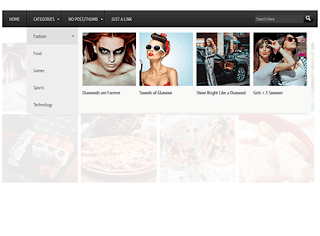
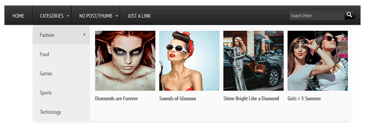
Visual content holds a certain appeal that websites integrate images to every page, or even operate solely through photos. Now, with the new AJAX navigation menu widget, images can be added to the drop-down menu as well.

The AJAX navigation menu for blogger is a widget designed specifically for the Blogger platform. It is inspired from the Mashable website long before it was given a makeover. Despite the plain and simple inspiration, the drop down menu with images is a huge hit.

It works based on the jQuery library and Blogger JSON Feed API. Function-wise, it works just like a normal drop-down menu when JavaScript is disabled. For it to work online, a blog must be for public visitors, so the Blogger JSON Feed API will function as designed.

Features

Multi-Level Menu Support

The AJAX menu is a multi-level drop-down menu that is based on the standard unordered list of HTML. When a menu contains a sub-menu, it loads on the fly when a user rolls over the main menu. What is great about this is that it saves outgoing traffic, especially on a website that uses a large navigation.

Cross-browser Compatibility

Most AJAX applications will work across different browsers even with other plugins or proprietary technology already installed.  The menu with images works in the same premise, instead of being designed for a specific browser. Because there is no telling which browser you or your blog readers would use, the new AJAX drop-down mega menu with images is the ideal option.

Some of the Windows browser supported includes IE5+, Firefox, Google Chrome, Safari Netscape 7+ and Opera 8+. When you're using a Mac, the AJAX menu is supported on Firefox, IE and Safari. If JavaScript is disabled, however, the menu is still accessible, but only as pure CSS menu.

Automatic Sub-Menu Display

With the new AJAX menu, you only need to roll over a menu item and sub-menus will automatically load. No need to click on a menu to get the sub-menu to drop down. This not only saves users' valuable navigation time, but also outgoing traffic.

Menu Styling

AJAX menus can be styled by simply changing the megamenu.js and the CSS style. The former is used when javaScript is turned on, while the latter is when it is turned off. You can adjust the menu parameters manually or you can use ready-to-use templates.

There are plenty of other features, but you would not be able to use or experience them if you do not install the new mega menu with images. What do you need to do then to implement it in your blog or website?


Adding Mega Menu with Images/Thumbnails in Blogger

Step 1. Log in to your Blogger account, then go to the Dashboard. Select the blog where you want to install the new mega menu.

CSS

Step 2. Click on Template, then press the Edit HTML button. Press anywhere inside the code area and use the CTRL + F function to make your search quicker and easier. Type the following tag and hit Enter to find it:
]]></b:skin>
Once you find the tag, add the code below just above/before it:
.megamenu *{margin:0;padding:0;font-family:'PT Sans Narrow'}ul.megamenu{list-style:none;line-height:1;overflow:visible !important}ul.megamenu:after{margin:0;padding:0;content:' ';display:block;height:0px;clear:both}ul.megamenu li{float:left;display:inline;position:relative;text-transform:uppercase}ul.megamenu li a.menu-target:after{content:"";width:0;height:0;border-left:3px solid transparent;border-right:3px solid transparent;border-top:3px solid #fff;font-size:0;line-height:0;bottom:22px;right:5px;position:absolute}ul.megamenu li a{display:block;line-height:50px;padding:0px 20px;text-decoration:none;border-left:1px solid #000;box-shadow:1px 0 0 0 rgba(255, 255, 255, 0.1) inset;color:#d9d9d9;font-size:14px;transition:all 0.3s ease-in-out}ul.megamenu li a:hover{background:#111111;color:#fff}ul.megamenu ul{position:absolute;display:none;top:100%}ul.megamenu li:hover > ul{display:block}ul.megamenu ul li{z-index:72;min-width:149px;float:none;background:#000;text-shadow:none}ul.megamenu ul li a{text-transform:none;font-weight:normal}ul.megamenu ul li a:hover,ul.megamenuid ul li a.hover{background:#E0E0E0;color:#444}ul.megamenu ul ul{display:none;left:100%;top:0}ul.megamenuid li div.megasubmenu{background:#F9F9F9;position:absolute;width:830px;z-index:90;left:0;top:100%;overflow:hidden;min-height:150px;-moz-transform:translate(0,30px);-webkit-transform:translate(0,30px);-o-transform:translate(0,30px);transform:translate(0,30px);transform-origin:50% 0;visibility:hidden;opacity:0;color:#888;box-shadow:0 10px 7px -7px rgba(0,0,0,0.1);transition:all 0.3s ease-in-out}ul.megamenuid li:hover div.megasubmenu{visibility:visible;opacity:1;-moz-transform:translate(0,0);-webkit-transform:translate(0,0);-o-transform:translate(0,0);transform:translate(0,0)}ul.megamenuid ul,ul.megamenuid ul li{display:block !important;border:0 none !important;margin:0 !important;padding:0 !important}ul.megamenuid ul li{background:none !important;float:left !important}ul.megamenuid ul.leftmenulist{position:absolute;width:18%;left:0;top:0;bottom:0;background:#EEEEEE;border-right:1px dashed #e5e5e5 !important}ul.megamenuid ul.leftmenulist a{border-left:none !important;color:#555}ul.megamenuid ul.rightmenulist{position:relative;display:block;width:81%;float:right;margin:0px 0px 0px !important;background:none}ul.megamenuid ul.rightmenulist li{display:block;overflow:hidden;position:relative;min-height:210px;padding:5px 17px 5px 0px !important}ul.megamenuid ul.rightmenulist li .thumb-container{left:0;width:100%;height:100%;position:absolute;overflow:hidden;font-size:0;line-height:0}ul.megamenuid ul.rightmenulist li .thumb-container img{position:relative;top:10px;padding:0;width:100%;height:100%;display:block}ul.megamenuid ul.rightmenulist li a{display:block;border-left:none !important;padding:0px 5px !important;line-height:1.4;color:#777;font-weight:bold;font-size:14px}ul.megamenuid ul.rightmenulist li a:hover{color:#000;background:transparent}ul.megamenuid .loading-icon{background:url('https://blogger.googleusercontent.com/img/b/R29vZ2xl/AVvXsEh13V2hKCm0p29-GzskyaXbzaqLR6rImKNZCOF7stE8qaOLHDQlF-m_dhHWS6F-WPtAatm3m4pVaYEtMhZ9V51Wo7RNryvMQaxF0hNOGbWiJbWxzEyvji_MzwO84wboqVYMRerzV1FjNIE/s1600/wait.gif') no-repeat scroll 0 0 transparent;width:22px;height:22px;position:absolute;top:50%;margin-top:-11px;right:5px}ul.megamenuid .menu-icon{border-bottom:4px solid transparent;border-top:4px solid transparent;border-left:4px solid #777;display:block;height:0;margin-top:-4px;position:absolute;right:11px;top:50%;width:0}#megamenuid{background:rgba(0, 0, 0, 0) -moz-linear-gradient(center top , #3d3d3d, #212121) repeat scroll 0 0;background:-webkit-linear-gradient(top,#3d3d3d,#212121);background-color:#3d3d3d;box-shadow:1px 1px 0 0 rgba(255, 255, 255, 0.1) inset;height:50px;width:100%;position:relative;max-width:1000px;margin:0 auto;padding:0px}#megamenuid h5{font-size:16px;margin-top:70px;text-align:center}#megamenuid h5:before{content:"";position:absolute;top:50px;left:50%;width:5px;height:2px;margin-left:-4px;border-left:2px solid black;border-right:2px solid black}#megamenuid h5:after{content:"";position:absolute;top:55px;left:50%;width:10px;height:5px;margin-left:-7px;border-top:2px solid black;border-left:2px solid black;border-right:2px solid black;border-radius:8px 8px 0px 0px}li.search-box{float:right !important;line-height:35px;margin:7px 10px 0 0}li.search-box .search-field{border:none;padding:3px;background:#3F3F3F;color:#fff;width:135px;font-size:13px}li.search-box .search-field:focus{border:none;outline:none;background:#4C4C4C;color:#fff}li.search-box .search-button{background:url('https://blogger.googleusercontent.com/img/b/R29vZ2xl/AVvXsEj7YjuHnUrIkennOvmwK_6h7gk3Mi1S8SXJtVUuEOsq7xJCT4Mii7MtanOepQj1bIAUEnVQ7vUDnEU7fv-txaiye17tOhOxx8jsZNIDohsvTY3dqOTNtYprqUptPpIHtyNgeNM7meSrpQk/s1600/search.png') no-repeat;border:none;cursor:pointer;padding:5px 10px;transition:all 0.3s ease-in-out}li.search-box .search-button:hover{opacity:0.9}.search-alert{background:#E84C3D url(https://blogger.googleusercontent.com/img/b/R29vZ2xl/AVvXsEjEpWuW6mizyY2N_w_QkHC9M12ycxavimuGg9odn9ujuY1E98A1uzTJaX3H_287uF0Ui1WeH64iAW1mTkQqhM_tlSEP8fHOdr8jwVkEFvopPP3WrX8meN5-JNPmXRWR83wEO_5uzOnuAbM/s1600/search-info.png) no-repeat;background-position:5px;text-transform:capitalize;color:#fff;margin:-5px;padding:0px 15px 0px 40px;display:none;border-radius:5px}

JavaScript

Step 3. Check if your blog has the jQuery plugin already installed. If not, you need to add a few lines of code before the </head> tag (CTRL + F to find it). See the code below:
<script src='http://ajax.googleapis.com/ajax/libs/jquery/1.8.2/jquery.min.js' type='text/javascript'/>
<script type='text/javascript'>
//<![CDATA[
(function(e){var t=function(e,t){this.elem=e;this.settings=t;this.megaMenuHtml();this.ajaxcall=null;this.menulist=this.elem.find(".leftmenulist li a");this.menuHelper(this.elem);this.addEvents()};t.prototype={regex:{islabel:new RegExp("/search/label/","g"),issearch:new RegExp("[?&]q=","g"),labelsearch:new RegExp("(http://[^/]+)/search/label/([^/?&]+).*[?&]q=([^$&]+)(?:[^$]+)?","g"),label:new RegExp("(http://[^/]+)/search/label/([^/?&$]+)","g"),search:new RegExp("(http://[^/]+)/search/?[?&]q=(.*)","g")},addEvents:function(){var t=this;this.menulist.hover(function(){if(e(this).data("menuloaded")!=="true"){t.li=e(this);t.url=t.li.attr("href");t.container=t.li.closest("ul").siblings("ul");t.hoverOver()}},function(){t.hoverOut()})},hoverOver:function(){var t=this;this.getAJAXUrl();if(!this.ajaxUrl)return;this.ajaxcall=e.ajax({type:"GET",url:t.ajaxUrl,dataType:"jsonp",data:t.ajaxData,beforeSend:function(){t.showLoader()},success:function(e){t.hideLoader();t.addArrow();t.showPosts(e)},error:function(e){t.showError(e)}})},hoverOut:function(){this.ajaxcall.abort();this.hideLoader()},getAJAXUrl:function(){if(this.url){var e=this;this.ajaxData={alt:"json","max-results":this.settings.postsNumber};this.url.search(this.regex.islabel)!==-1&&this.url.search(this.regex.issearch)!==-1?this.ajaxUrl=this.url.replace(this.regex.labelsearch,function(t,n,r,i){e.ajaxData.q=i;return[n,"/feeds/posts/default/-/",r,"/"].join("")}):this.url.search(this.regex.islabel)!==-1&&this.url.search(this.regex.issearch)===-1?this.ajaxUrl=this.url.replace(this.regex.label,function(t,n,r){delete e.ajaxData.q;return[n,"/feeds/posts/default/-/",r,"/"].join("")}):this.url.search(this.regex.islabel)===-1&&this.url.search(this.regex.issearch)!==-1?this.ajaxUrl=this.url.replace(this.regex.search,function(t,n,r){e.ajaxData.q=r;return[n,"/feeds/posts/default"].join("")}):this.ajaxUrl=!1}else this.ajaxUrl=!1},showLoader:function(){e("<span></span>",{"class":"loading-icon"}).appendTo(this.li.closest("li"))},hideLoader:function(){this.li.closest("li").find("span.loading-icon").remove()},showPosts:function(t){var n=this,r=[],i,s,o;t.feed.openSearch$totalResults.$t>0?e.each(t.feed.entry,function(t,u){i=u.title.$t;e.each(u.link,function(e,t){t.rel==="alternate"?s=t.href:s="#"});o=u.media$thumbnail?u.media$thumbnail.url.replace(/\/s72\-c\//,"/s200-c/"):n.settings.noThumbnail;r.push('<li><span class="thumb-container"><a title="',i,'" href="',s,'"><img alt="',i,'" src="',o,'"/><br />',i,"</a></span></li>")}):r.push("<h5>","No posts available.","</h5>");this.container.html(r.join(""));this.menulist.removeData("menuloaded");this.li.data("menuloaded","true")},showError:function(e){if(e.statusText==="error"){this.hideLoader();this.addArrow();this.container.html("<h5>Oops... Could not fetch the blog posts.</h5>")}},addArrow:function(){this.menulist.closest("li").find("span").remove();this.menulist.removeClass("hover-menu");this.li.addClass("hover-menu");e("<span></span>",{"class":"menu-icon"}).appendTo(this.li.closest("li"))},menuHelper:function(t){var n=this;t.find(">li").hover(function(){var t=e(this);t.find("a:first").addClass("hover-menu");var r=e(this).find("ul.leftmenulist li").height()*e(this).find("ul.leftmenulist li").length;t.find("ul.rightmenulist").css({"min-height":r+"px"});n.requestFirstAjax(t)},function(){e(this).find("a:first").removeClass("hover-menu")})},megaMenuHtml:function(){this.elem.find("ul ul").remove();this.elem.addClass("megamenuid").find(">li").find("ul:first").addClass("leftmenulist").wrap(e("<div></div>",{"class":this.settings.divClass}));e("ul.leftmenulist").after(e("<ul></ul>",{"class":"rightmenulist"}))},requestFirstAjax:function(e){e=e.find(".leftmenulist li:first-child a");this.url=e.attr("href");this.container=e.closest("ul").siblings("ul");this.li=e;this.hoverOver()}};e.fn.megaBloggerMenu=function(n){var r={postsNumber:4,divClass:"megasubmenu",postsClass:"rightmenulist",noThumbnail:"/default.png"},i=e.extend({},r,n);return this.each(function(){var n=new t(e(this),i)})}})(jQuery);
//]]>
</script>
<script type='text/javascript'>
jQuery(document).ready(function($) {
 $(&#39;#megamenuid&#39;).megaBloggerMenu({
  postsNumber : 4,
  noThumbnail : &#39;https://blogger.googleusercontent.com/img/b/R29vZ2xl/AVvXsEimmzq-xTVtZ3_kj-TujO1AvBBzZedTbkDI7iYAiQcITc9dNXiFyhXfuhogJex1tR0wTtrZoKjDUDyMD0Ch5RxPf0F22dXlHcENGJMFB6SJ4IrVt85BxhVIq4cLpLHiWePwYEZXWch2cRI/s1600/no_image_available.png&#39;
 });
});

$(function(){
  $(&#39;.search-here&#39;).submit(function(e){
    if($(&#39;.search-box .search-field&#39;).val().length==0){
       $(&#39;.search-box .search-alert&#39;).fadeIn().css(&#39;display&#39;,&#39;inline-block&#39;);
      e.preventDefault();
    }
  });
});
</script>

Note

- If jQuery plugin already exist, remove the line in red.
- To change the number of posts, change the 4 value from:
postsNumber : 4
- To add a different thumbnail when a post has no image, replace the url in blue from:
noThumbnail : &#39;https://blogger.googleusercontent.com/img/b/R29vZ2xl/AVvXsEimmzq-xTVtZ3_kj-TujO1AvBBzZedTbkDI7iYAiQcITc9dNXiFyhXfuhogJex1tR0wTtrZoKjDUDyMD0Ch5RxPf0F22dXlHcENGJMFB6SJ4IrVt85BxhVIq4cLpLHiWePwYEZXWch2cRI/s1600/no_image_available.png&#39;

HTML

Step 4. Carefully add the HTML code to ensure that the drop down menu with images will work as designed. There are only three types of URLs that the AJAX Menu accepts and they must be used accordingly.

Label URL: http://yourblogurlblogspot.com/search/label/LABELNAME
Search Query: http://yourblogurl.blogspot.com/search?q=SEARCHQUERY
Label w/ Search Query: http://yourblogurl.blogspot.com/search/label/LABELNAME?q=SEARCHQUERY

Among the three URLs, the Search Query has to be URL encoded using a specific tool.

Step 5. Search the following line using CTRL + F:
<div class='main-outer'>
Just above this line, add the following HTML code:
<ul class='megamenu' id='megamenuid'>
<li><a href='/'>Home</a></li>
<li><a class='menu-target' href='#'>MENU TITLE</a>
<ul>
<li><a href='http://ADDURLHERE.com'>LABEL NAME</a></li>
</ul>
</li>
<li><a class='menu-target' href='#'>MENU TITLE</a>
<ul>
<li><a href='http://ADDURLHERE.com'>LABEL NAME</a></li>
</ul></li>
<li><a href='http://ADDURLHERE.com'>Normal Link</a></li>
<li class='search-box'>
<form action='/search' class='search-here' method='get'>
<input class='search-field' name='q' placeholder='Search Here' size='30' type='text'/>
<input class='search-button' type='submit' value=' '/>
</form>
<p class='search-alert'>Search form is empty!</p>
</li>
</ul>
<div class='clear'/>
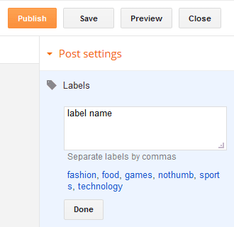
Note: replace the text in blue with the label url and the text in red with the name of the label. This is the label that you have added to the Labels settings of your post editor:


Step 6. Click on Save template for all the changes to take effect.

If you can't find the line from step 5, access the Layout tab, click on Add Gadget, and then choose HTML/JavaScript Gadget. Copy the HTML code and paste it inside the box... then press the Save button.

That's it!

Once that is done, your AJAX menu with images will be implemented and ready for you to use. Make sure to choose photos that are relevant to the menu and sub-menus so your website will have cohesive look and appeal. Research shows, however, that text accompanied by any image, even if completely irrelevant, can grab attention.