الأربعاء، 27 أغسطس 2014

How to Display Most Commented Posts in Blogger

One of the best gadgets for your Blogger blog is a popular posts widget for your sidebar. This lets visitors see what your trending posts are right now and encourages them to click on them to read them. This basic widget is just a little too basic, however, for the modern day website visitor. Not only do they want to see your trending posts, but they also want to join the discussions that are happening on your blog. To do that, you'll need a most commented posts widget for Blogger.

Having a customized widget on your site is a lot easier than you might think. In order to have an effective widget, however, you're going to need a few specific things to help you out.

most commented posts widget


Here's What You're Going To Get

There are certain aspects in the design of a most commented posts widget that you should expect. That's why you'll find these specific components with this custom widget:

  • Ordered by popularity. The posts that have the most comments are the most likely to have visitors want to read the post and join in with the conversation. By ordering your posts based on the popularity of them, you'll give each visitor the chance to see what the hype really is about! This lets you have a charted graphic that gives a visitor easy recognition, but also allows you to keep it straight and aligned if you're looking for a cleaner look.
  • Graphic incorporation. Blog posts that have at least one graphic incorporated with them will receive 100% more traffic than posts that have no images at all. For every graphic that you include with a blog post, the more likely you are to get a click! The same is true with your most commented posts widget, so be sure to incorporate graphics that stand out with your design.
  • Descriptions that blend in. The internet today revolves around the value that you can provide each individual user. People don't just click on things because they look visually tempting. They click on them because they promise a level of value that another website like yours isn't able to provide. By having descriptions that blend in, you'll be able to enhance the perceived value that your site can provide. This leads to more clicks!

Related: Add Multi-Colored Popular Posts to Blogger

Add the Most Commented Posts Widget to Blogger

Step 1. Log in to your Blogger account and go to Template, press the "Edit HTML" button.

Step 2. Click anywhere inside the code area and press the CTRL + F keys to open the Blogger' search box. Type the following tag inside it and hit Enter to find it:
</Group>
Step 3. Just below </Group>, add this code:
<Group description="Most Commented" selector=".most-commented">
<Variable name="most.commented.background1" description="background color1" type="color" default="#fa4242" value="#ee377a"/>
<Variable name="most.commented.background2" description="background color2" type="color" default="#ee6107" value="#fcad37"/>
<Variable name="most.commented.background3" description="background color3" type="color" default="#f0f" value="#f8e000"/>
<Variable name="most.commented.background4" description="background color4" type="color" default="#ff0" value="#c7e93d"/>
<Variable name="most.commented.background5" description="background color5" type="color" default="#0ff" value="#5ebded"/>
</Group>

add code to blogger html
Note: if you can't find the </Group> tag, try to find the following tag instead and add the variables just below it:
<b:skin><![CDATA[

Step 4. Now search for the following tag (CTRL + F):
]]></b:skin>
Step 5. And just above it, add this CSS code:
.comment-count {
    padding: 3px 10px;
    background: #fff;
    color: #000;
    font-size: 10px;
    float: right;
}

.most-commented ul {
    padding: 0px !important;
    font-family: Century Gothic, sans-serif;
}

.most-commented ul li {
    list-style-type: none;
    padding: 10px;
    color: #555;
    margin-top: -10px;
}

.most-commented ul li a {
    color: #444;
    font-weight: bold;
    text-decoration: none;
    font-size: 11px;
}

.most-commented ul li img {
    float: left;
    margin: 0px 5px 0px 0px;
    width: 60px;
    height: 60px;
}

.most-commented:nth-child(3n+0) {
    background: $(most.commented.background1);
    width: 100%;
}

.most-commented:nth-child(4n+0) {
    background: $(most.commented.background2);
    width: 95%;
}

.most-commented:nth-child(5n+0) {
    background: $(most.commented.background3);
    width: 90%;
}

.most-commented:nth-child(6n+0) {
    background: $(most.commented.background4);
    width: 85%;
}

.most-commented:nth-child(7n+0) {
    background: $(most.commented.background5);
    width: 80%;
}
Step 6. Save the template.

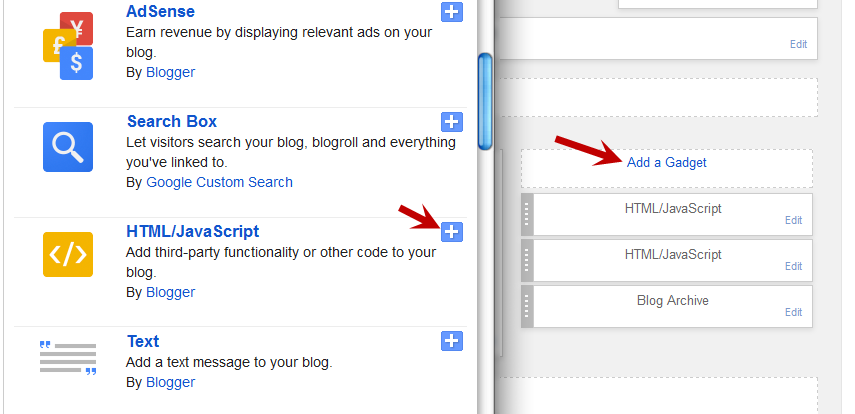
Now, let's add the Most Commented Posts widget to the Layout of our Blogger blog. Head over to the "Layout" section of your Blogger dashboard and click on the "Add a gadget" link on the right side. From the pop-up window, scroll down the list and select the "HTML/JavaScript" gadget:

blogger html javascript gadget

Copy and paste this script inside the content box:
<script type="text/javascript">
function stripTags(s,n) {
    return s.replace(/<.*?>/ig,"").split(/\s+/).slice(0,n-1).join(" ")
}
function mostcommented(feed) {
    var i;
    for (i = 0; i < feed.count ; i++) {
var postURL = "'" + feed.value.items[i].link + "'";
var postTitle = feed.value.items[i].title;
var postthumbnail = "<img src="+feed.value.items[i].postthumbnail+" />";
var postDescription = feed.value.items[i].postdescription;
var postComments = feed.value.items[i].commentcount;
var postList = '<div class="most-commented"><ul><li><div class="comment-count">' + postComments + "</div>" + postthumbnail + "<a href="+ postURL + '">' + postTitle + "</a>"  + '<p>' +stripTags(postDescription,10)+'...</p>' + '</li></ul></div>';
 document.write(postList);
     }
 }
 </script>
<script src="http://pipes.yahoo.com/pipes/pipe.run?
AddUrlHere=http://helplogger.blogspot.com
&NumberofPosts=5
&_id=2cb5eb603ed55a6264ee1484e5fdd45c
&_callback=mostcommented
&_render=json"
type="text/javascript"></script><span style="font-size: 80%; float:left;"><a href="http://helplogger.blogspot.com/2014/08/most-commented-posts-blogger-widget.html">Add this widget</a></span>
Here, change http://helplogger.blogspot.com with your blog URL. If you want to add more characters to the description, modify the "10" value in red from "postDescription,10".

If you want a more simple look (without the thumbnails and post snippets), add this script instead:
<script type="text/javascript">
function stripTags(s,n)
    {
    return s.replace(/<.*?>/ig,"").split(/\s+/).slice(0,n-1).join(" ")
}
function mostcommented(feed) {
 var i;
 for (i = 0; i < feed.count ; i++)
 {
var postURL = "'" + feed.value.items[i].link + "'";
var postTitle = feed.value.items[i].title;
var postComments = feed.value.items[i].commentcount;
var postList = '<div class="most-commented"><ul><li style="margin-bottom: 10px"><div class="comment-count">' + postComments + "</div>" + "<a href="+ postURL + '">' + postTitle + "</a>"  + '</li></ul></div>';
 document.write(postList);
 }
 }
 </script>
<script src="http://pipes.yahoo.com/pipes/pipe.run?
 AddUrlHere=http://helplogger.blogspot.com
&NumberofPosts=5
&_id=2cb5eb603ed55a6264ee1484e5fdd45c
&_callback=mostcommented
&_render=json"
type="text/javascript"></script>
<span style="font-size: 80%; float:left;"><a href="http://helplogger.blogspot.com/2014/08/most-commented-posts-blogger-widget.html">Add this widget</a></span>
.... and replace http://helplogger.blogspot.com with your address.
To add the "comments" text after the comments number, replace the line in red:
<div class="comment-count">' + postComments + "</div>"
with:
<div class="comment-count">' + postComments + " comments" + "</div>"
Once you have finished adding your own settings, press the "Save" button to enable the gadget in the sidebar of your blog. That's it!

configure html javascript gadget

To change the background colors of the most commented posts, go to "Template" > hit the "Customize" button and navigate to "Advanced" > "Most Commented" tab. Here you can pick 5 different colors by clicking on the color boxes:

blogger template designer

Once you've selected your favorite color scheme, click the "Apply to blog" button to save the changes... and you're done.

Why Use the Most Commented Posts widget?

The basic psychology in every human is that they want to feel like they belong to a community. That's exactly what this customized widget will bring to your site. No matter what content drew a visitor to see your content, this widget will invite them to join the lively parts of your piece of the internet. This helps to build relationships, with you and with other visitors, and this relationship-building engagement is what you need to start having real value.

Take the time to install this most commented posts widget on your site and you'll see for yourself why this is one of the most useful widgets that is available right now. Enjoy ;)

الثلاثاء، 26 أغسطس 2014

How Firebug Helps You Design Your Blogger Blog

For most bloggers, the idea of adjusting the coding of their blog to improve the user experience is daunting at best and often quite frightening. HTML5, CSS, and other coding elements are their own virtual language and for the average Blogger user looking to update a personal blog, the automatic settings are about as good as it gets. What if there was a better way to code a blog, whether a beginner or a pro, that could be done within the browser itself?

If you're using Firefox or Chrome, then you should also be using Firebug. It allows you to code your website in real time, so you can maximize the UX of your blog in no time at all.

You No Longer Need To Edit Through Blogger!

If you've ever tried to update a Blogger theme through the editing functions of the website, then you know how difficult it can be. You can preview your designs, but you can't save any changes to officially see what is going to happen with your site until you publish the edits. If you've missed just one line of code or forgotten one small element, you're going to have to go back into the editing matrix, find the error, update it again, and repeat until you have a responsive blog once again.

What Firebug allows you to do is see all of those elements that make up a website in real time. Instead of editing and then publishing, you can edit in real time and see updates happen, all without affecting the user experiences of visitors that are coming to your site while you're editing. You can change the fonts, colors, or virtually anything else within the design of the site quickly and see the results of your work as it happens. Don't like it? Just undo your changes.

It's really that easy.

Using Firebug to Customize CSS in Blogger

This guide will show you how to modify the CSS code of a Blogger template. Usually, the Blogger Template CSS style declarations are editable through the style.css file, found between the <b:skin> and </b:skin> tags.

To download Firebug and get more details regarding its powerful features, visit: Firebug for Firefox, or if you are using Chrome, get the Firebug Lite app. I would recommend to use Firefox, which is more complete and quick, but, nevertheless, both work the same.

Once Firebug is installed, a small bug icon will be available in the upper right of your Web browser's address bar. Clicking it, a horizontally split screen will be shown at the bottom of the browser's window. The page will continue to show in the upper half, while the lower half will show the HTML of the current web page.

firebug

To customize any web element from a Blogger template, just click either on the Firebug icon in the toolbar, or the "Inspect Element with Firebug" item in the context menu. Next, click the blue cursor button to Inspect and place the cursor right over the element to customize.

For example, let's say that we want to change the title of the "Blog Archive" gadget. After we clicked the inspect button, mouse over the "Blog Archive" title which will be highlighted as shown in the screenshot below. To change this element, click on it:

inspect element using firebug

Now that we decided which element we want to change, right click on the "Style" panel and select the "Add rule" option:

add CSS rule in firebug

This will give the class or the id of the highlighted element - in our case, the heading of the Blog Archive (#BlogArchive1 > h2). To edit this rule that we just added, click anywhere near the left curly bracket that will open a text box, so that we can type a new CSS declaration:

firebug css declaration

And here comes the fun part. Let's say that we want to make the title red. We will type color and hit Enter, then we will type the color value or the red text and hit Enter. We will also set the set the font size to 20px, text alignment to center (text-align: center) and make the text underlined (text-decoration: underline):

modify blogger css with firebug

The cool thing about Firebug is that when modifying any CSS property, you can see the results directly applied on the page. So, after adding these declarations, we'll see a big red underlined title for our Blog Archive gadget (see in the screenshot above).

To apply this CSS rule on a Blogger template, just select it beginning from the right curly bracket and to the #(id) or .(class) symbol, then right click it and Copy the CSS code.

copy firebug css rule

Before making any change, it's highly recommended to make a backup of your current template. Go to "Template" and click the "Backup/Restore" button on the upper right side. On the same "Template" location, click on the "Customize" button and navigate to "Advanced" > "Add CSS". Paste the CSS rule that you just copied into the CSS box:

add firebug css to blogger template

Click the "Apply to blog" button on the upper right corner to save the changes and view your blog.

Firebug Also Gives You One Distinct Advantage...

One of the best reasons to install Firebug into Chrome or Firefox is that it allows you to emulate some of your favorite website designs quickly and easily. Instead of hiring a web designer to do the work, which could cost you thousands, you can simply start Firebug and see what the CSS styles are for your favorite site. This allows you to create a similar widget.

From there, all you've got to do is change the coding to make the design elements work under the rules of your own custom.css. This means you can make easy design changes to your Blogger blog without having to go through all of the menus and editing functions so that your template can truly be your own. Do you have some work to do? Sure - but Firebug does all of the primary work for you.

All you've got to do is have a creative mind and a few minutes to make changes to the coding design. Whether you've been coding for years or are just starting your first blog, this is definitely the best way to make sure that your visitors have the best experience possible!

الاثنين، 25 أغسطس 2014

Add a Pinterest Pin It Mouseover Button on Blogger Images

Images have always played a prominent role in attracting new visitors through search engines like Google and Bing. But when Pinterest decided to enter the social media mix, it upped the ante in a big way.

Pinterest lets blog owners use their service to add a 'pin' to photos or content images on the site. When visitors of that site see a photo they like, they can choose to click on the red Pinterest button for Blogger, and add it to their Pinterest account.

The person who pressed your Pinterest button for Blogger can now see your photo on their dashboard, and share it with friends or followers on the service. They can also come across this photo when users add keywords or category tags to the image. More importantly, that photo links to your site when clicked on and will contain a description title of your blog name or post.

Therefore, adding the Pinterest button for Blogger will help you to benefit from tons of new traffic coming from Pinterest and people who had found your photos and post links using the service. Here are some steps to add your very own Pinterest button.

1. Access your Blogger Template

The first thing to do is to edit the code of your template so that it knows when to display this Pinterest Button for Blogger with the content. You can do this by logging into your Blogger Dashboard and finding your way to "Template" > "Edit HTML".

blogger template html

When the editor opens up, it may look a bit foreign to you if you don't have much experience using HTML. Click anywhere inside the code area and search by pressing the CTRL + F keys for the </body> tag - hit Enter to find it:
</body>
The body tags makes up the general content in your webpage. Think of it like the settings panel of a website. If you were to delete everything in this section your site would turn into a blank white page.

2. Add The Pinterest Pin it Script

Once you found the </body> tag, insert the following script just above it:
<script>
//<![CDATA[
var custom_pinit_button = "https://blogger.googleusercontent.com/img/b/R29vZ2xl/AVvXsEjfAh5wo0H01YmgzDx_iUJQCEUyzUZqsaGFmJNdClj60ua0RHGL-MYsr0ER_E-bHCA1HpMs4fheJiwrQRncRcvR7G1Gkyg09VcH6Hsc-j9SN5Bu5FHQNr7wSZ73SrZt5VSMV-Ikq4aaRVLq/s1600/pinit-button.png";
var pinit_button_position = "center";
var pinit_button_before = "";
var pinit_button_after = "";
//]]>
</script>
<script src='http://ajax.googleapis.com/ajax/libs/jquery/1.8.2/jquery.min.js' type='text/javascript'></script>
<script id='pinit-img-button' type='text/javascript'>
// Visit helplogger.blogspot.com for more widgets and tricks.
//<![CDATA[
eval(function(p,a,c,k,e,r){e=function(c){return(c<a?'':e(parseInt(c/a)))+((c=c%a)>35?String.fromCharCode(c+29):c.toString(36))};if(!''.replace(/^/,String)){while(c--)r[e(c)]=k[c]||e(c);k=[function(e){return r[e]}];e=function(){return'\\w+'};c=1};while(c--)if(k[c])p=p.replace(new RegExp('\\b'+e(c)+'\\b','g'),k[c]);return p}('1i(1j).1k(r($){$(\'M\').1l(\'<6 p="4:D;" N="A" O="\'+13+\'" >\');$(\'#7-6-P\').1m();3 l;3 m;3 n;$(\'.A\').1n(r(){m=$(\'.A\').E(F);n=$(\'.A\').G(F);$(\'.A\').1o()});3 o=$(\'#7-6-P\').1p().1q("1r.1s.14");o!=-1&&15();r 15(){$(\'.s-16 6,.H-M 6,.s-17 6\').1t(\'.18,.18 6\').1u(r(){$(\'.7-4\').t("4","D");19(l);3 a=$(q);3 b=1a(a.t("Q-u"));3 c=1a(a.t("Q-v"));3 d;3 e;1v(1w){B\'1x\':d=a.9().u+a.G(F)/2-n/2;e=a.9().v+a.E(F)/2-m/2;C;B\'1y\':d=a.9().u+b+5;e=a.9().v+c+a.E()-m-5;C;B\'1z\':d=a.9().u+b+5;e=a.9().v+c+5;C;B\'1A\':d=a.9().u+b+a.G()-n-5;e=a.9().v+c+a.E()-m-5;C;B\'1B\':d=a.9().u+b+a.G()-n-5;e=a.9().v+c+5;C}3 f=a.1C(\'O\');3 g=a.1D(\'.H,.1E,.s\').R(\'.H-S,.s-S,.s-1F\');3 h=g.1G();w(T U===\'V\'){U=\'\'}w(T W===\'V\'){W=\'\'}w(g.R(\'a\').1H){X=g.R(\'a\').I(\'Y\').1b(/\\#.+\\b/1c,"")}Z{X=$(1I).I(\'Y\').1b(/\\#.+\\b/1c,"")}3 i=\'<1d N="7-4" p="1e:x;9: 1J;z-1K: 1L;" ><a Y="1M://1N.14/1O/1P/P/?1Q=\'+X+\'&1R=\'+f+\'&1S=\'+U+h+W+\'" p="1e:1T;1U:x;" 1V="1W"><6 N="1X" p="-1Y-J-K:x;-1Z-J-K:x;-o-J-K:x;J-K:x;10: 0.8;20:21;Q: 0;22: 0;23:0;" O="\'+13+\'" S="24 1f 25" ></a></1d>\';3 j=a.11().26(\'a\')?a.11():a;w(!j.y().27(\'7-4\')){j.28(i);w(T l===\'V\'){j.y(\'.7-4\').I("1g","q.p.10=1;q.p.4=\'12\'")}Z{j.y(\'.7-4\').I("1g","q.p.10=1;q.p.4=\'12\';19(29)")}}3 k=j.y(".7-4");k.t({"u":d,"v":e});k.t("4","12");k.L().1h(2a,1.0,r(){$(q).2b()})});$(\'.s-16 6,.H-M 6,.s-17 6\').1f(\'2c\',r(){w($.2d.2e){3 a=$(q).y(\'.7-4\');3 b=$(q).11(\'a\').y(\'.7-4\');l=2f(r(){a.L().t("4","D");b.L().t("4","D")},2g)}Z{$(\'.7-4\').L().1h(0,0.0)}})}});',62,141,'|||var|visibility||img|pinit||position||||||||||||||||style|this|function|entry|css|top|left|if|none|next||loadpinitbutton|case|break|hidden|outerWidth|true|outerHeight|post|attr|box|shadow|stop|body|class|src|button|margin|find|title|typeof|pinit_button_before|undefined|pinit_button_after|pinitURL|href|else|opacity|parent|visible|custom_pinit_button|com|hoverCheck|content|summary|nopin|clearTimeout|parseInt|replace|gi|div|display|on|onmouseover|fadeTo|jQuery|document|ready|append|hide|load|remove|html|indexOf|helplogger|blogspot|not|mouseenter|switch|pinit_button_position|center|topright|topleft|bottomright|bottomleft|prop|closest|hentry|header|text|length|location|absolute|index|9999|http|pinterest|pin|create|url|media|description|block|outline|target|_blank|pinimg|moz|webkit|background|transparent|padding|border|Pin|Pinterest|is|hasClass|after|pinitOnHover|300|show|mouseleave|browser|msie|setTimeout|3000'.split('|'),0,{}))
//]]>
</script>

adding pinterest script

3. Changing the Position of the Pin it! button

The cool thing about this code is that you have some freedom over where the Pinterest button for Blogger will go over the image. Take a look at the code that you just copied and pasted into the HTML for the word 'center'.
var pinit_button_position = "center";
To move the pin to a different area of the photo, replace center with one of these texts:
topleft
topright
bottomleft
bottomright
And to change the Pin it! button that appears on mouse over, replace the address in blue from above with your own:
var custom_pinit_button = "https://blogger.googleusercontent.com/img/b/R29vZ2xl/AVvXsEjfAh5wo0H01YmgzDx_iUJQCEUyzUZqsaGFmJNdClj60ua0RHGL-MYsr0ER_E-bHCA1HpMs4fheJiwrQRncRcvR7G1Gkyg09VcH6Hsc-j9SN5Bu5FHQNr7wSZ73SrZt5VSMV-Ikq4aaRVLq/s1600/pinit-button.png";

pinit script

4. Save The Template

Make sure that you added everything correctly, then save the template and navigate to a recent post that you made that contain images. Hover your mouse over the image and you should now see a red Pinterest button for Blogger displayed on the image. Test it out and see it how it works.

If you want to hide the pinit button from a specific image, when you create a post, switch to the HTML tab of your post editor and type class="nopin" right before the closing slash and angle bracket of your image element, like this:

nopin pinterest

The only downside of this button is that it doesn't take the information from your custom image titles. It's automatically set to take the title of the blog post where the image is located. So, you'll need to pay closer attention to the title of the posts so that it fits closely with the images being shown.

Remember that when you have this code activated, you have to label your titles so that they are relevant to the photos you are posting. This might sound obvious, but sometimes you create a post with an image as a joke that won't make sense in the context of viewing it on Pinterest.

If you use Google Analytics, you can start to see traffic flooding into your site from Pinterest. You should also create your own Pinterest account so that you can manage the content and track how it's being shared. That's it. Enjoy and happy blogging!

الخميس، 21 أغسطس 2014

The Basics of Google Analytics for Beginners

If you're a business owner or a member of a marketing team, you probably know that businesses depend upon data. Tracking trends and patterns is what allows you to get ahead of the dips in the market, and make informed decisions on the direction of your company.

Those same rules that apply to business apply to owning a website. In order to deliver the best possible experience and ensure that customers from around the world are able to access your site, you need to understand from where traffic is coming from and how to leverage that information to your benefit.

Setting Your Site Up With A Tracking ID

Google analytics won't start collecting data from your website until you've implemented a tracking code into your website's files. The tracking code is basically a block of JavaScript code that will collect data about the html that visitor used to get to your site, any cookies that the visitors has collected during their browsing history, and information about what type of browser the person is using.

The importance of this information provides you with information on how to conform your web-site to the target audience, especially in terms of design. If customers are visiting your website from an eCommerce directory, you may want to modify those links so that the customers arrive at a landing page instead of a home page. If more customers are using smartphones and tablets instead of laptop browsers, you may have to redesign the site so that it is responsive and can be easily read from a small screen.

google analytics tracking code

In order to track each individual page on the website, you will need to add a tracking code before the </head> code of your template. If you are using a site like WordPress or Joomla! that depends on templates, you may just have to add the tracking code on the main HTML index file. Keep in mind that it can take upwards of 24-hours for Google to begin collecting information and importing that data to your dashboard, so don't expect to see measurable results right away.

Tutorial: How to Add Google Analytics to Blogger

Researching the Data

Once you insert the code into your site, it will begin tracking data from anyone who visits your site. This data is then sent back to the Google servers and stored in your Google Analytics profile. From there, you can determine what type of information that you want to look at.

The two features of Google Analytics that are often most useful to new users is the ability to track where customers are coming from, and the ability to see keywords that have been effective in drawing in audiences.

google analytics overview

Traffic Origins

Open up your Google Analytics dashboard and click on 'Acquisition'. You should see a few options, but you want to pull 'All Referrals' so that you can the entire list of visitors.

Next to the referral path will show a few links with a number of how many people visited your site from that link. From here you can click on the link and find out the reason for the traffic. Maybe someone has written a review on the service, you can check to see if the advertisement campaign you are operating is producing results.

google analytics all referrals

Keywords

Within the same 'Acquisition' directory is another option called 'Search Engine Optimization'. Click on this link and then click on 'Queries' to look up a list of keywords being used to describe your site. The dashboard will display an overview of up to 1,000 words or phrases used on Google that brought new visitors to your site. You can use this information to modify your posts and producing content to increase the results of certain key phrases that you feel would benefit your customer outreach.

search engine optimization, ga queries

Demographics

Underneath the audience tab, you can also track demographics. This little option will allow you to view the age, gender, and interests of individual users and segments of your visiting population. Say for example you run a senior care facility for the retired and want to put together a A/B split test to determine which advertising campaign works best. After adding the campaign to a landing page or section of your site, you can look back and find out if retired citizens are the ones responding to your ads, or if you are just bringing in traffic from younger generations who may not be interested in your services.

google analytics, georgraphical summary

Custom Campaign Tagging

Custom campaign tagging is more of an advanced feature, but once you get used to the Google Analytics interface, you can use this to separate your campaigns and easily filter through data. Maybe you just want to find out who is coming to your site from your email newsletters, and not from the general site. Google Analytics will allow you to post special links to your content on those channels of communication and then view these results under the acquisition tab and then campaigns.

Determining What Works, and What Doesn't

Using the tools that Google Analytics provides at your disposal allows you to really determine what type of experience you want to provide your customers. Within the first month of use, if start to see trends or patterns in data that you feel you feel you can improve upon, you can use this information as a guide to edit your sites design and layout.

Getting used to the program might seem overwhelming at first, but once you jump right in and start playing around all the features, you'll get the hang of it in no time. Google Analytics really is an important tool that every website owner should have.

الخميس، 14 أغسطس 2014

How to Center the Blogger Header Image

The header of a website is what distinguishes your blog; it's your identity or digital fingerprint. Whenever a visitor accesses your blog for the first time, the header is one major aspect that is used to determine who you are and the type of content that they can expect to read. Therefore, it's important to develop a header that is both prominently placed and telling of your brand name.

What would seem to be counterintuitive to that idea is the default Blogger settings for header positioning. Whenever you upload a header to the site, it will automatically be aligned to the left of the page. Some Blogger users may be okay with this setting, especially if they are using a header design that doesn't contain a background. Others may find that their background headers appear cut off, incomplete, or indistinguishable from the rest of their content.

If you find yourself in the second category of users, there is a way to adjust the positioning of your header so that it is displayed as a center Blogger header. By centering your site header, you have greater flexibility over the overall design, and it allows you to really shine light on this content. It's hard to miss a header that is placed smack dab in the middle of the screen on every page that someone navigates to.

Center Header Image with Blogger Template Designer

center blogger header

Making the change is relatively easy. You'll be able to make these adjustments on every page of your Blogger blog without having to change them individually. All you need to do is to modify the CSS of your blog that can be found directly through your Blogger dashboard. Even if you have little to no experience in web design or coding, you can center Blogger header by following these next few steps.

Step 1. Log in your blogger account and select your blog, then go to "Template" and click the "Customize" button on the right side.

center blogger header

Step 2. Navigate to "Advanced" > "Add CSS" tab and paste the code in the empty box:
#header-inner {
background-position: center !important;
width: 100% !important;
text-align: center;
}
#header-inner img {
margin: auto;
}
If you have a small image and you want it to become full width, add this CSS instead:
#header-inner {
 background-size: cover;
 width: 100% !important;
 text-align: center;
 }
 #header-inner img {
 width: 100%;
 height: 100%;
 }

Step 3. Hit the ENTER key after you paste the code snippet, then click the "Apply to Blog" button.

blogger header centered

Here are some other aligning options for your headers:

Align Blogger Header Banner and Text Side by Side

Image on the right and title on the left

#header-inner {
background-position: right !important;
width: 100% !important;
}
.titlewrapper, .descriptionwrapper {
float: left;
clear: both;
margin-left: 20px;
}

Image on the left and title on the right

#header-inner {
background-position: left !important;
width: 100% !important;
}
.titlewrapper, .descriptionwrapper {
float: right;
clear: both;
margin-right: 20px;
}
Note: for larger images, you may need to resize them in order to make them appear side by side with the text.

That's it!

After making the changes to the CSS and saving your modifications, you may navigate back to your homepage. Refresh the page and you'll notice that the header is now centered, instead of on the left. Click on a few of your page links and make sure that this modification has been made to every page or post on the blog.

If by chance you don't see the changes to the header, go back through the code that you modified and make sure that you have copied and pasted the information into the file exactly as instructed. Even minor modifications in the code, or a missing semicolon may fail to make the changes you are trying to achieve, or come away with different results than what's expected.

The great thing about CSS is that it is your site's central hub for all things design. From the CSS file, you can modify just about any appearance on your site to give the blog a custom look and feel. Once you're comfortable performing minor adjustments to the appearance of your site, you can start to get creative and come up with your very own modifications.

الأربعاء، 6 أغسطس 2014

Make Blogger Header, Navigation and Footer Full Width

Blogger is a user-friendly service that provides a lot of really attractive looking default templates for those just starting out. Default templates come in handy, but the nice things about owning your own blog is that you have the chance to add your own personal touch. As a matter of fact, templates aren't made to restrict your freedom of design, but instead they're there to provide you a foundation to build from. With every default template available on Blogger, you can make changes to fit your style.

One of the most common requests out of the Blogger community when making alterations is how to change the look of some of the key sections like headers, navigation, and footers. Initially, these items are designed to fit within just 1/3 of the page, surrounded by padding and margins on either side. These margins are used to give the page a slim fitting appearance, but could also cause your content to look compressed.

Important: Backup your Template

Making the changes to a full screen Blogger navigation, footer, or header can be done and won't take you much time. Before you can make any changes, you should save extra copies of the template .xml file in case anything goes wrong. That way, if you don't like it or it doesn't come out looking like it should, you can reuse the contents of the original file to restore your blog to working condition.

Demo

Hover your mouse over the image to see a before and after example:


How to Make Header, Navigation and Footer Full Width in Blogger


Step #1: Access Your CSS File

If you've never opened up your CSS file before, log in to your Blogger account, select your blog and navigate to Template > Edit HTML. This will bring up the code of your template containing all your blog's internal files in one place.

Step #2: Modify the Background

Click anywhere inside the code area > press CTRL + F keys and type the following line > hit Enter to find it (stop at the first occurrence of it):
body {
Just below body { you should see some lines that will look like this:
body {
font: $(body.font);
color: $(body.text.color);
background: $(body.background);
padding: 0 $(content.shadow.spread) $(content.shadow.spread) $(content.shadow.spread);
$(body.background.override)
}
Where you see the highlighted line above in the code, remove the line and replace it with:
padding: 0px;
Different templates will have minor variations, but you should still be able to find these lines within every template.

Step #3: Change the Content Section

Next, search using the CTRL+F keys for this part:
.content-inner {
Just below it, you will see this line:
.content-inner {
padding: $(content.padding) $(content.padding.horizontal); 
}
Remove the line in red and replace it with:
padding: 0px;
This will remove any of the padding around the inner content, so it won't leave any room on both sides.

Now find this part:
$(content.background.color.selector){
Just below it you will see this line:
$(content.background.color.selector){
background-color: $(content.background.color);
}
Replace the line in red with:
background-color: $(body.background);
Finally, search for this tag:
]]></b:skin>
And just above it, add this CSS:
.main-outer {
background: $(content.background.color);
}

Step #4: Make the Content Outer Full Width

Content is displayed differently between browsers, so you'll next want to fix this so that it alters the width across the board. This code can be found searching for:
.content-outer, .content-fauxcolumn-outer, .region-inner {
And just below it you will see the following lines:
.content-outer, .content-fauxcolumn-outer, .region-inner {
min-width: $(content.width);
max-width: $(content.width);
_width: $(content.width);
}
Delete the line in red and replace that line with:
max-width: 100%;

Step #5: Finish It Up

Now you have just two more lines you need to change. Look for:
</b:template-skin>
And click on the right arrow to expand the styles. Note: you will need to search for </b:template-skin> tag again, and just before it you'll see these symbols highlighted in yellow:
]]>
</b:template-skin>
Above this ]]></b:template-skin> section of code, add the following:
.main-outer {
max-width: $(content.width);
margin: 0 auto;
}
Then run a search for:
]]></b:skin>
Add these lines of code just before/above it:
.tabs-inner {
padding: 0px;
}
.section {
margin: 0px;
}
.header-inner .widget {
margin: 0px;
}
Save the template and exit out of the editor.

Finished!

Following along with this tutorial won't affect or alter the pictures you are using on the blog, just the design of the content area. If you have a logo that stretches across the screen and fits perfectly for 1/3 page header, you will need to resize and re-upload this content so that it is able to work with the new adjustments.

الأحد، 3 أغسطس 2014

Automatically Resize Blogger Images to Fit Blog Post Area

resize blogger images automatically
Blogger offers most of the tools you would need to add and resize Blogger images quick and easy. You can upload photos directly on the platform and even change the dimensions based on the type of content that you are attempting to produce.

In order to do this, create a post and click on the small photo icon on the top toolbar next to the font style settings. A pop-up will show up on your screen asking you where you'd like to upload the image source. You have a choice between adding pictures from:

- Your local computer
- Previously uploaded images on the blog
- Picasa Web Albums
- An image URL

upload blogger image

Once you select the image that you want to use, you'll see four image sizes to choose from - small, medium, large, and x-large; it also gives you the option to determine the alignment. If you find that the four preset dimensions aren't providing the outcome you desire, there are easy ways to resize Blogger images to custom dimensions in order to fit your blog post area.

Step #1: Retain the Image Quality

If you know that you are going to need to resize Blogger images once you post them to your blog, make sure that you start with a photo larger than the 640px dimensions of the x-large option. It's easy to bring an image down in size, but if you try to make a small image bigger, you'll lose some of the quality. Just make sure that you watch out for the file size containing the image; the larger the file, the slower it will load on your website.

Photoshop is a powerful image editor that can help you to resize Blogger images or modify your images before you post, but it is also an expensive investment. There are also many other freeware image editors that can perform the simple task of resizing the photo. Determine what size you'd like the photo to display on the page and manually resize Blogger images to those dimensions; other users have found that 700px is a pretty flexible width size that works well on posts.

Once you've got your photo resized and added to your post, click on it and choose the 'Original size' option. If your photos are going to exceed the post editor, it probably means that they are larger than the body of your post, so let's fix that and make them fit exactly.

set image to original size

Step #2: Modify The Site's CSS

Next, you'll want to modify the CSS of your Blogger template to accommodate the adjustments. Don't worry; you won't need much coding experience to complete this task.

Open up the Blogger dashboard and go to 'Template' > 'Customize'. You'll see the option for 'Advanced', click on it and find your way to the 'Add CSS' tab... paste the following CSS code inside the empty box:
.post-body img {
max-width: 100%;
max-height: auto;
display: block;
margin: auto;
}
Adding the code to this section, automatically adds it between the <b:skin>....<b:skin> tags of your Template (Template > Edit HTML, above the ]]></b:skin> tag). So, no matter whether you add it above ]]></b:skin> or within the Add CSS box, the effect should be the same.

Remember that when you make changes to the CSS of the blog's Template, these changes will affect every post previously added, using the "Original size" dimension option.

To spruce up the post even more, add the last three lines shown in green below:
.post-body img {
max-width: 100%;
max-height: auto;
display: block;
margin: auto;
box-shadow: none;
border: none;
padding: 0px;
}
Screenshot

resize blogger pictures

This code will get rid of any borders and padding around the image and give it a much more natural look within the post. Hit the "Apply to Blog" button once you've finished adding it.

Note: This will only change the images set to Original size. To resize images with different sizes and apply this change on ALL the pictures added to your posts, add this CSS instead:
.post-body img {
width:100%;
height:100%;
display: block;
}
Please consider that, if you have posts with photos floating either on the right or left side of the content, they will automatically go full width.

Step #3: Create A Post

After making the adjustments to both file size and CSS, you may go back to the post editor and repeat the Step 1 to add an image. When you return to the screen that asks for size, click on the "Original size" option and confirm your choice. Your newly added image will then be displayed with the adjustments that you created, so that it fits nicely the width of the post area.